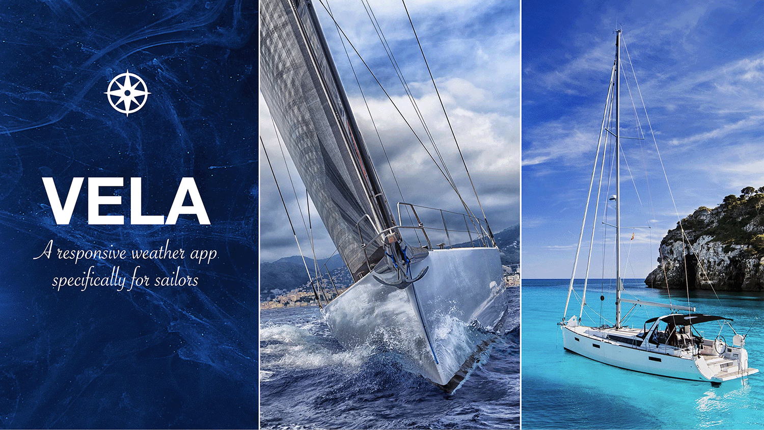
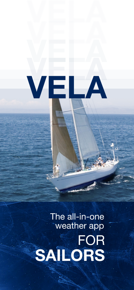
18
Access more than one app for weather models
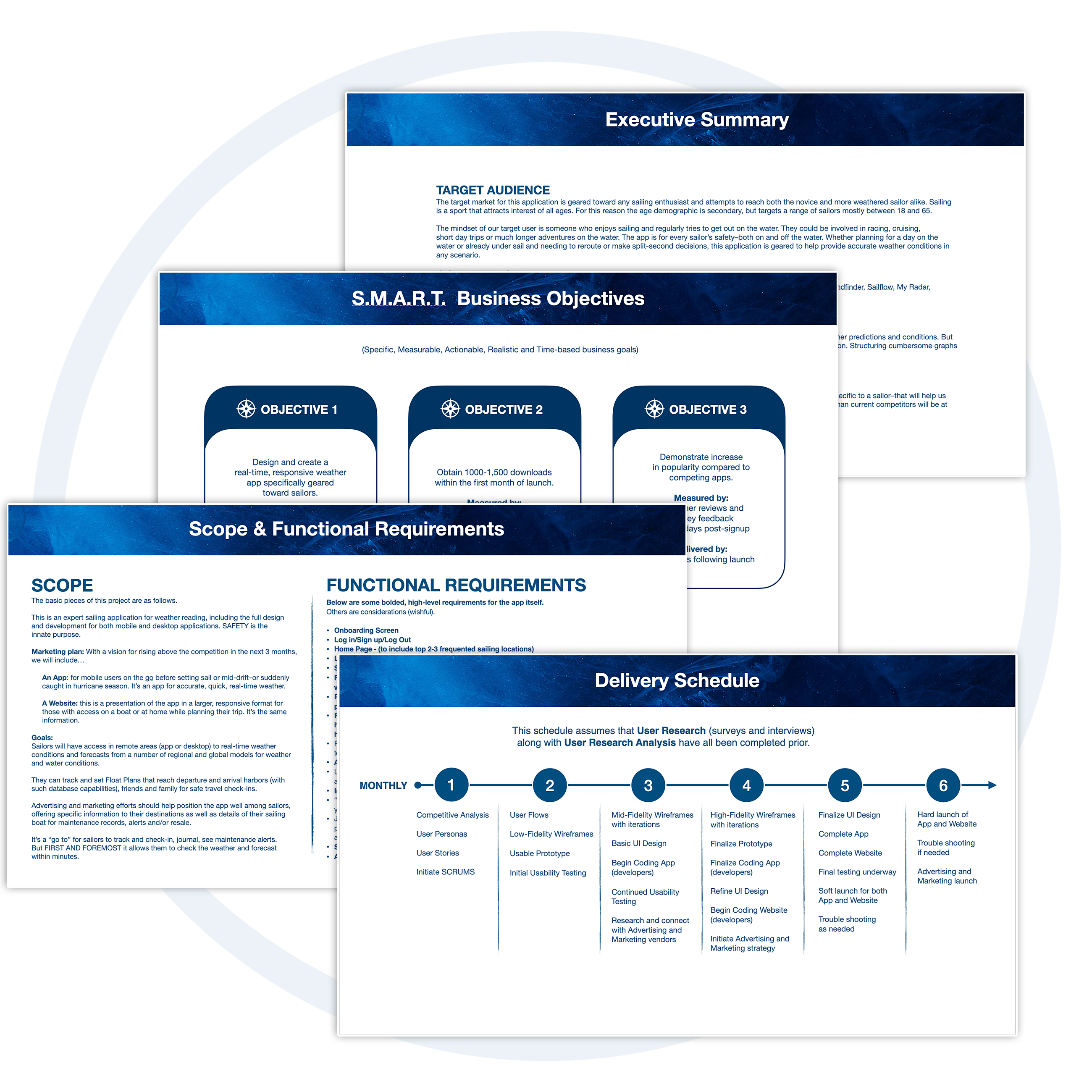
While there are many weather apps on the market for all types of outdoor activities, sailing enthusiasts seem to relentlessly use several apps for their needs on the water. The market of saturated real-time weather apps providing semi-reliable weather models (many don't include enough for comparison within a single app) are simply that–weather apps alone. The intention of VELA was to include several proven and trusted weather models as well as safety features for sailing, such as setting alerts and emergency contacts, customizing map views, easily saving and accessing favorite locations as well as submitting float plans, a captain's log (accessing vessel and current licensing data), and more... all within one application.

Both novice and well seasoned sailors need a way to quickly and easily understand real-time weather conditions and plan for a trip for the purpose of boating safety. Because there are very limited sources geared for sailors providing planning tools nor accurate weather, they have to access several sources before and during a sail.
• Complicated Graphs and Charts
• Hard to understand some weather readings
• Map reading can be cumbersome and non-intuitive
• There’s a lot of information to sort through
• Current weather forecasting models might be missing features that would make a sailor look elsewhere
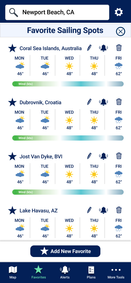
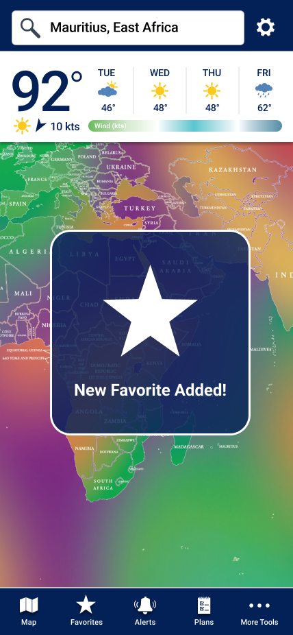
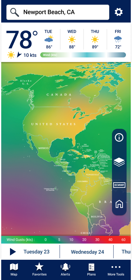
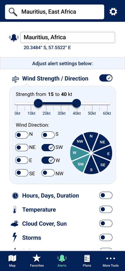
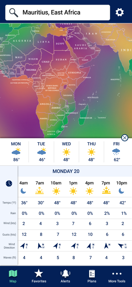
• Need to keep track of favorite sailing locations and set alerts for those locations.
• Need to send a float plan quickly and easily.
• Design and create a real-time, responsive weather app with safety tools and features that sailors use on a regular basis.
• Obtain 1000-1,500 downloads within the first month of launch.
• Demonstrate increase in popularity compared to competing apps.
• Simplified Graphs and Charts
• Clean, straightforward graphics with a more intuitive flow
• Condensing the information in more defined sections for easier navigation
• Having a better understanding of what sailors need in a weather app; their hierarchy of needs
We will know this to be true when we see an increase in user based subscriptions as well as positive app ratings and survey results.
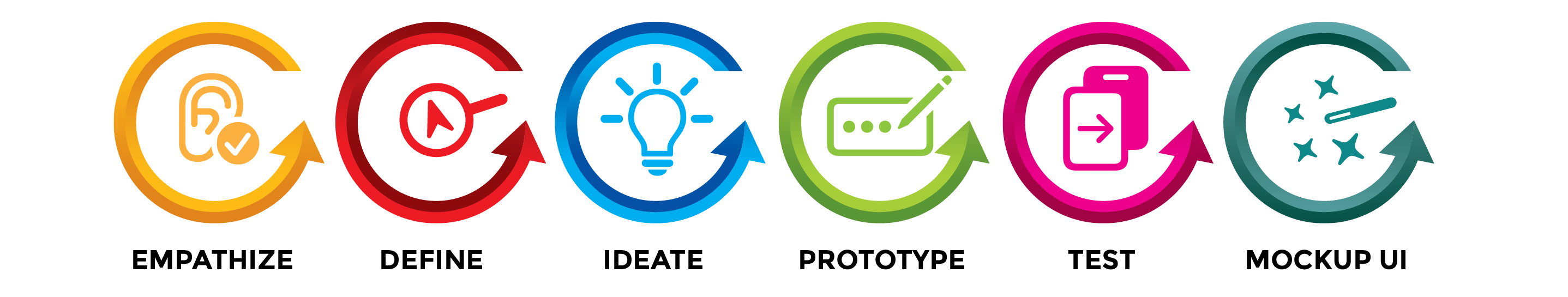
EMPATHIZE |
In order to work towards a solution, my ultimate goal is to truly understand and empathize with the problem at hand and the needs of the end user (the sailor). To stay aligned with the needs of the client, I also define the business objectives, study the competition, and conduct various user surveys & interviews. Attitudinal & Behavioral User Research become the foundation of the product. Following is a brief outline of each step in the "understanding and empathizing" stage of the process:
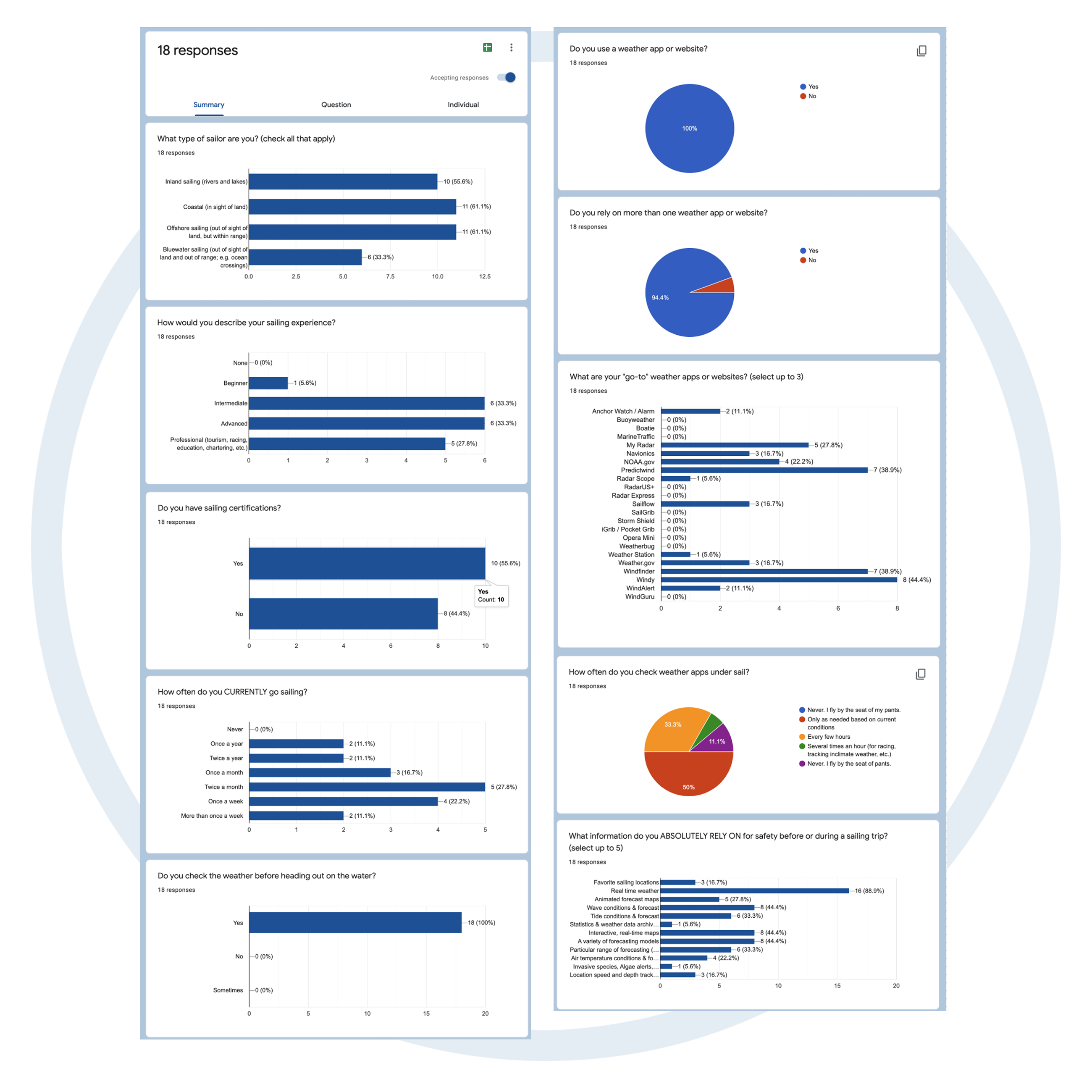
The Survey allowed several sailors to give their input without hassle and asked "check box" questions such as:
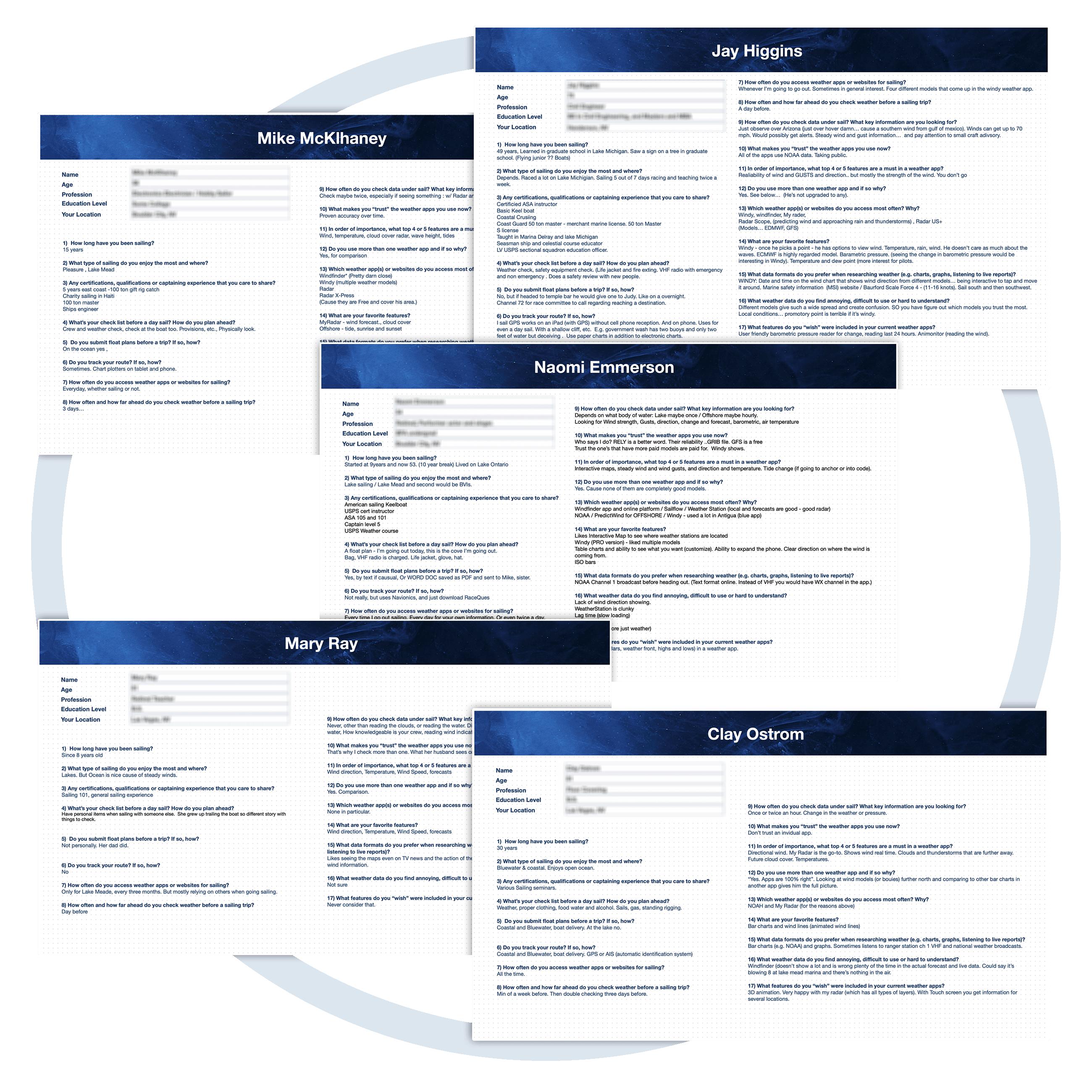
User interviews consisted of asking sailors of various experience levels about their needs and routines for checking weather, planning for a sailing trip and more.
Roughly 17 questions were asked of each participant, each of which were recorded and their comments notated.
I also inquired about apps they currently use and why they preferred particular applications.
DEFINE |
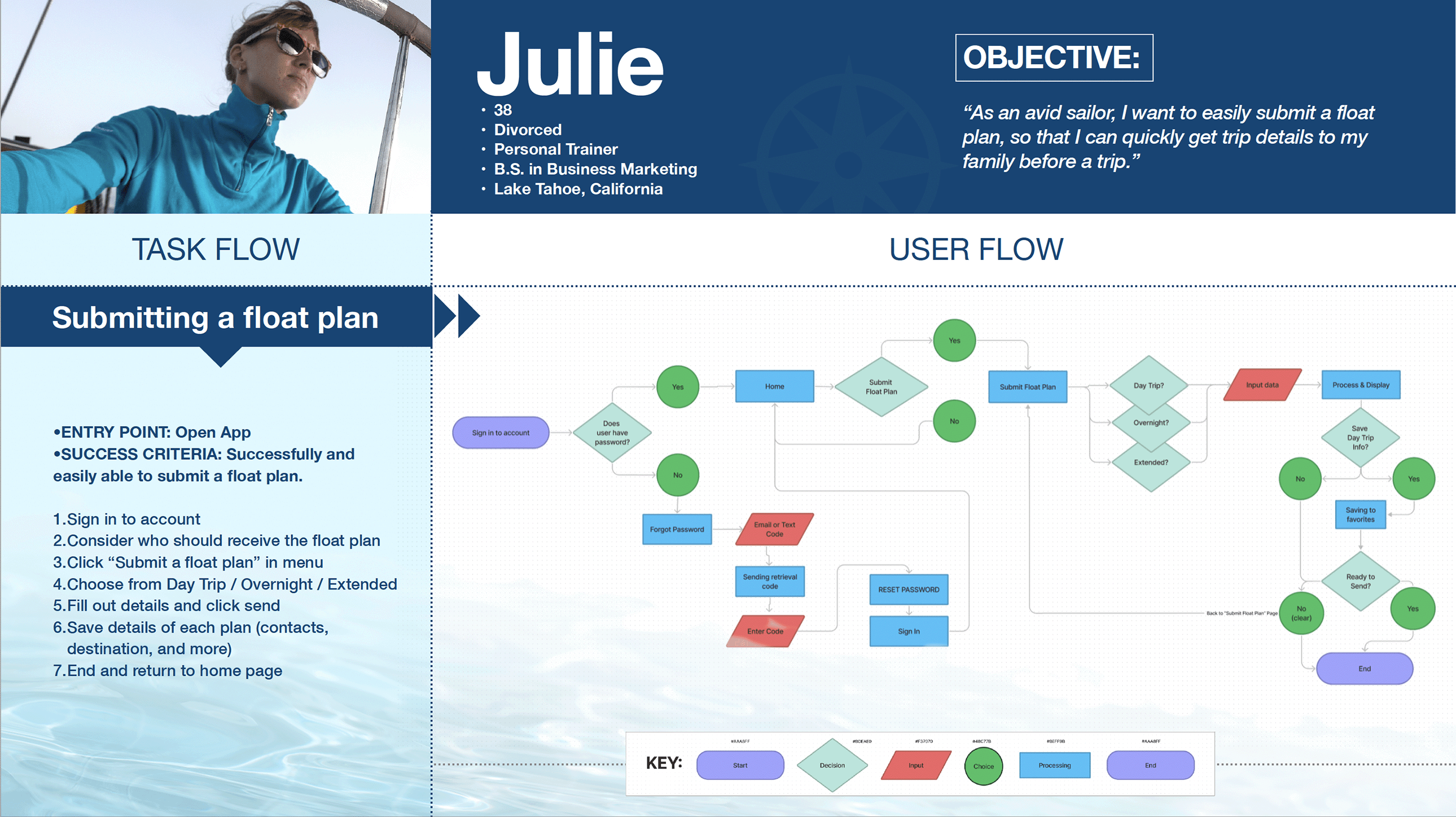
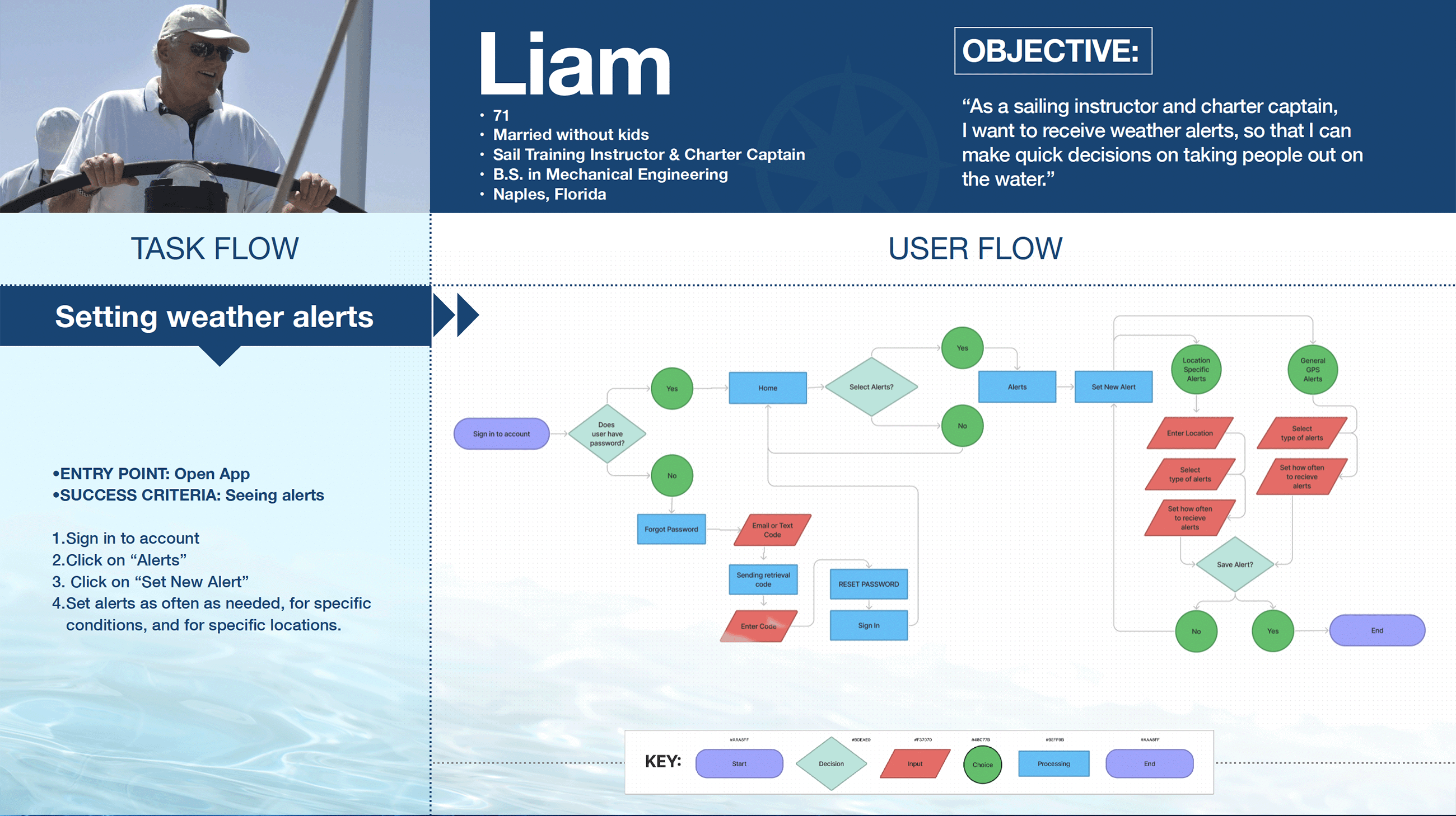
In this conceptualizing stage, we try to "see" the product from the user's perspective; their "POINT OF VIEW". We begin by creating a Problem Statement from our observations. We also create User Personas and dig deeper with synthesizing our user research.
Both novice and well seasoned sailors need a way to quickly and easily understand real-time weather conditions and plan for a trip for the purpose of boating safety. Because there are very limited sources geared for sailors providing planning tools nor accurate weather, they have to access several sources before and during a sail.
• Complicated Graphs and Charts
• Hard to understand some weather readings
• Map reading can be cumbersome and non-intuitive
• There’s a lot of information to sort through
• Current weather forecasting models might be missing features that would make a sailor look elsewhere
• Need to keep track of favorite sailing locations and set alerts for those locations.
• Need to send a float plan quickly and easily.
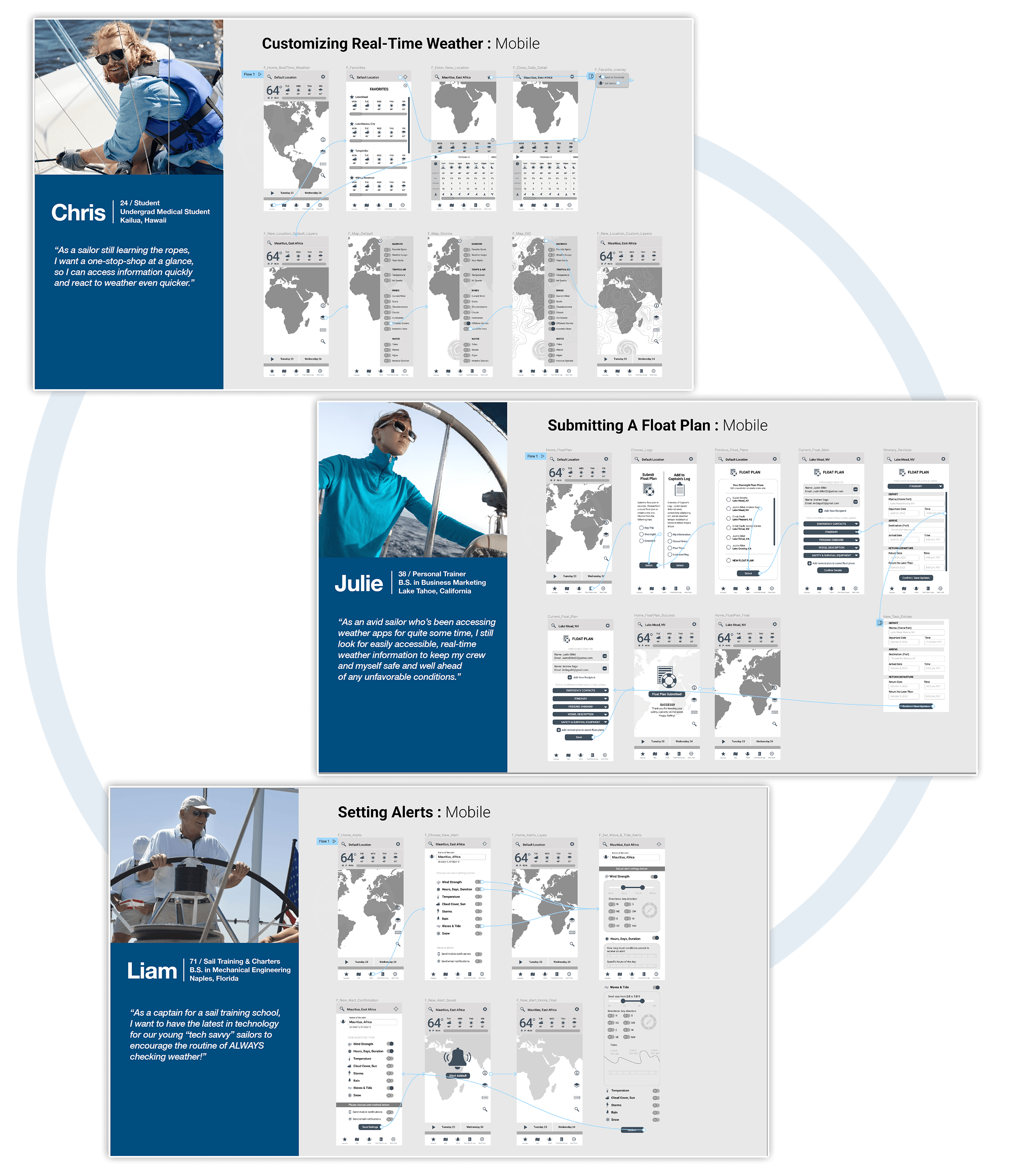
We create Design Personas - a type of persona that focuses on user motivations, behavior, and challenges and is based on user research and analysis of real people in the field. Design personas tell us a story about why the user employs and interacts with the web and applications in the way they do. Luckily for us, they’re great for communicating research insights and are the ideal type of persona to use when defining a product using the user-centered design process.
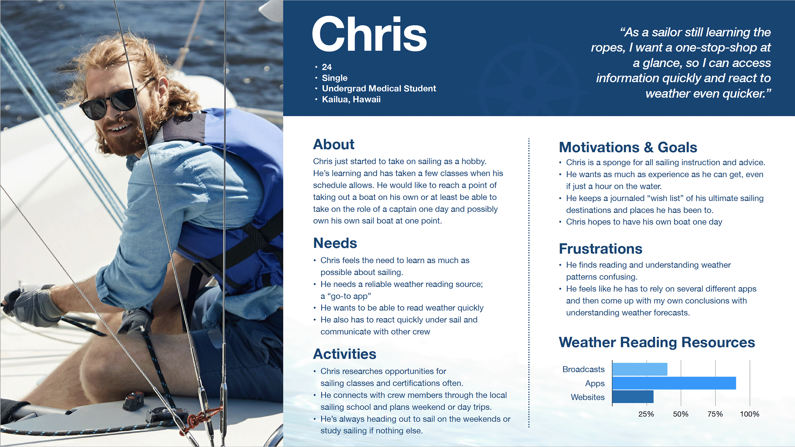
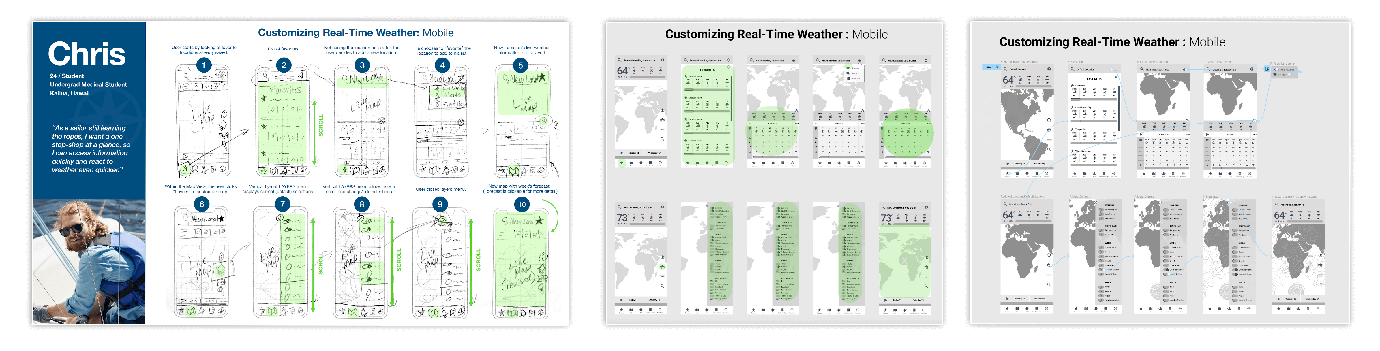
“As a sailor still learning the ropes, I want a one-stop-shop at a glance, so I can access information quickly and react to weather even quicker.”
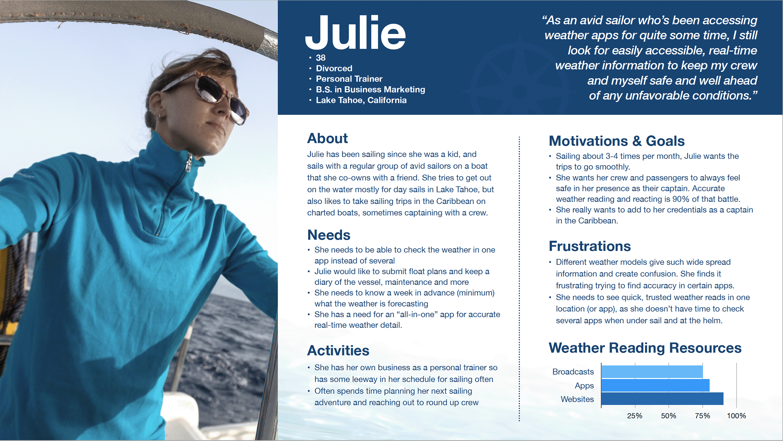
“As an avid sailor who’s been accessing weather apps for quite some time, I still look for easily accessible, real-time weather information to keep my crew and myself safe and well ahead
of any unfavorable conditions.”
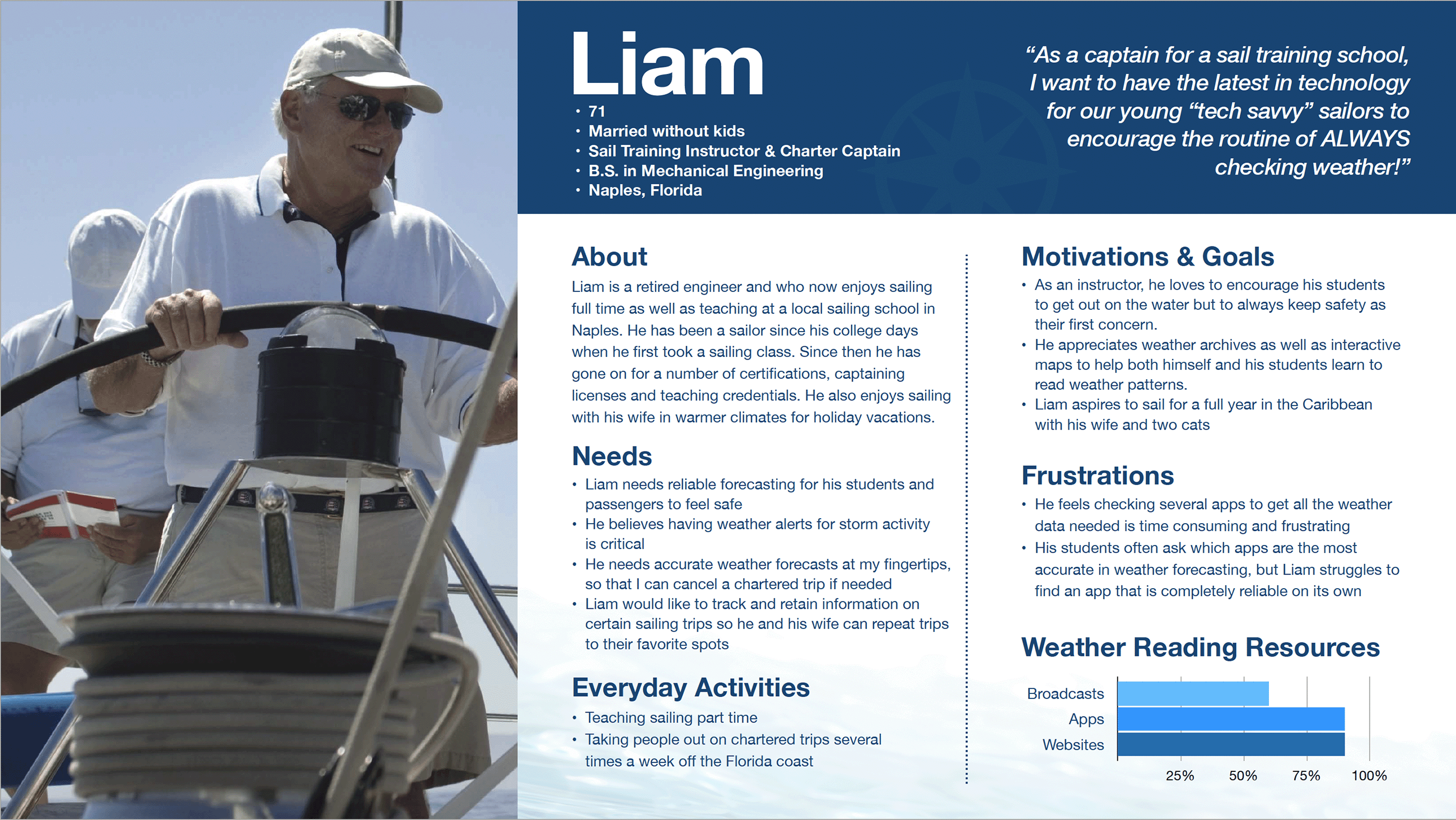
“As a captain for a sail training school, I want to have the latest in technology for our young “tech savvy” sailors to encourage the routine of ALWAYS checking weather!”
IDEATE |
Still in the conceptuatlizing process, I brainstorm and explore a wide variety of possible solutions. In this process I focus particularly on User Journies and User Flows. I also create User Stories to understand a wide range of user needs. During this phase, I also create the navigational structure of the app with Sitemaps as I gain user feedback from online Card Sorts.
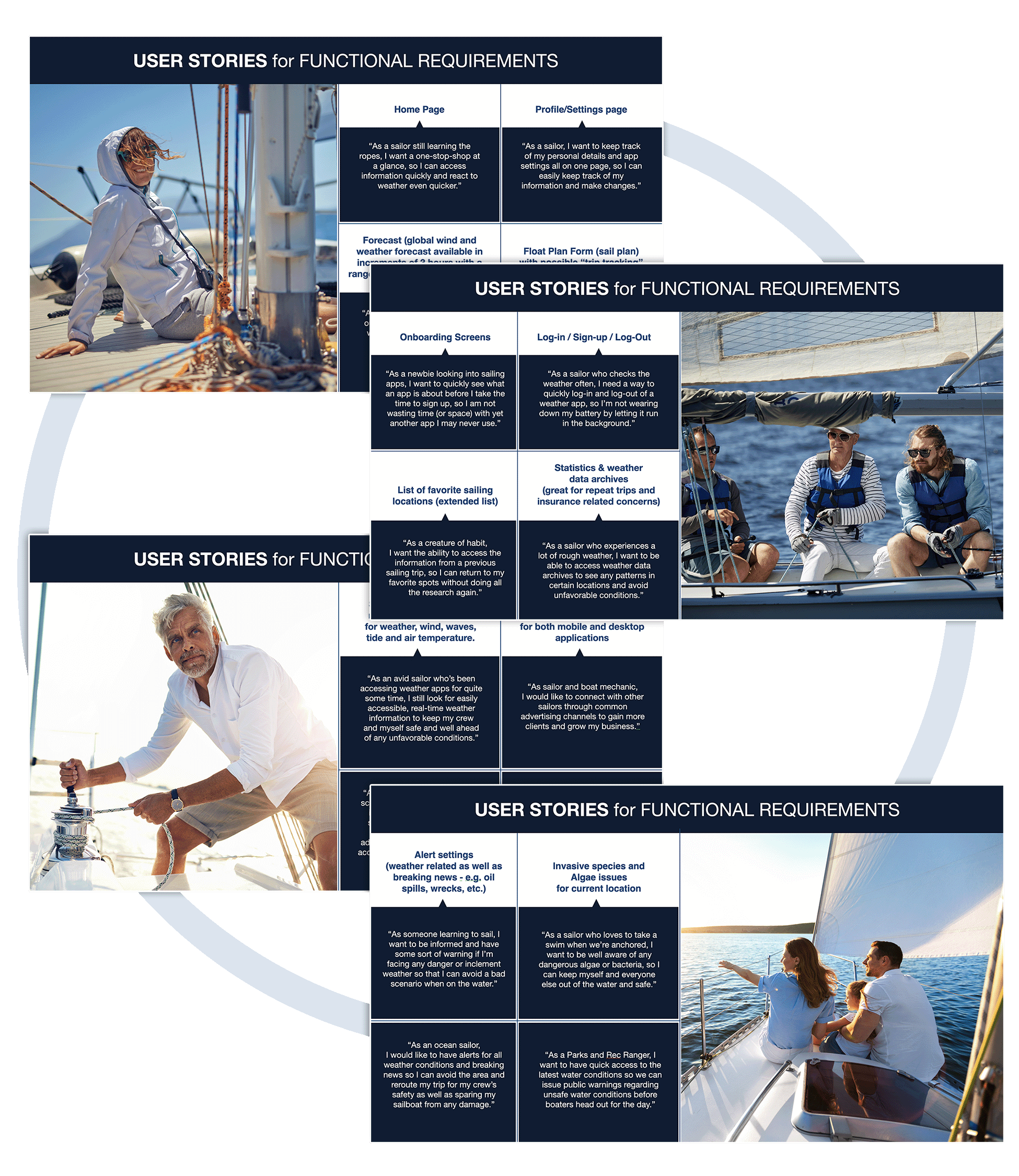
To bring the functional requirements of the app to life, we create User Stories. It helps us "to step in the minds" of our users and define our target audience.
E.g. “As a captain for a sail training school, I want to have the latest in technology for our young sailors who are already tech savvy, so that we can take advantage of the best and most accurate weather readings. My hope is to have students curious and routinely checking weather.”
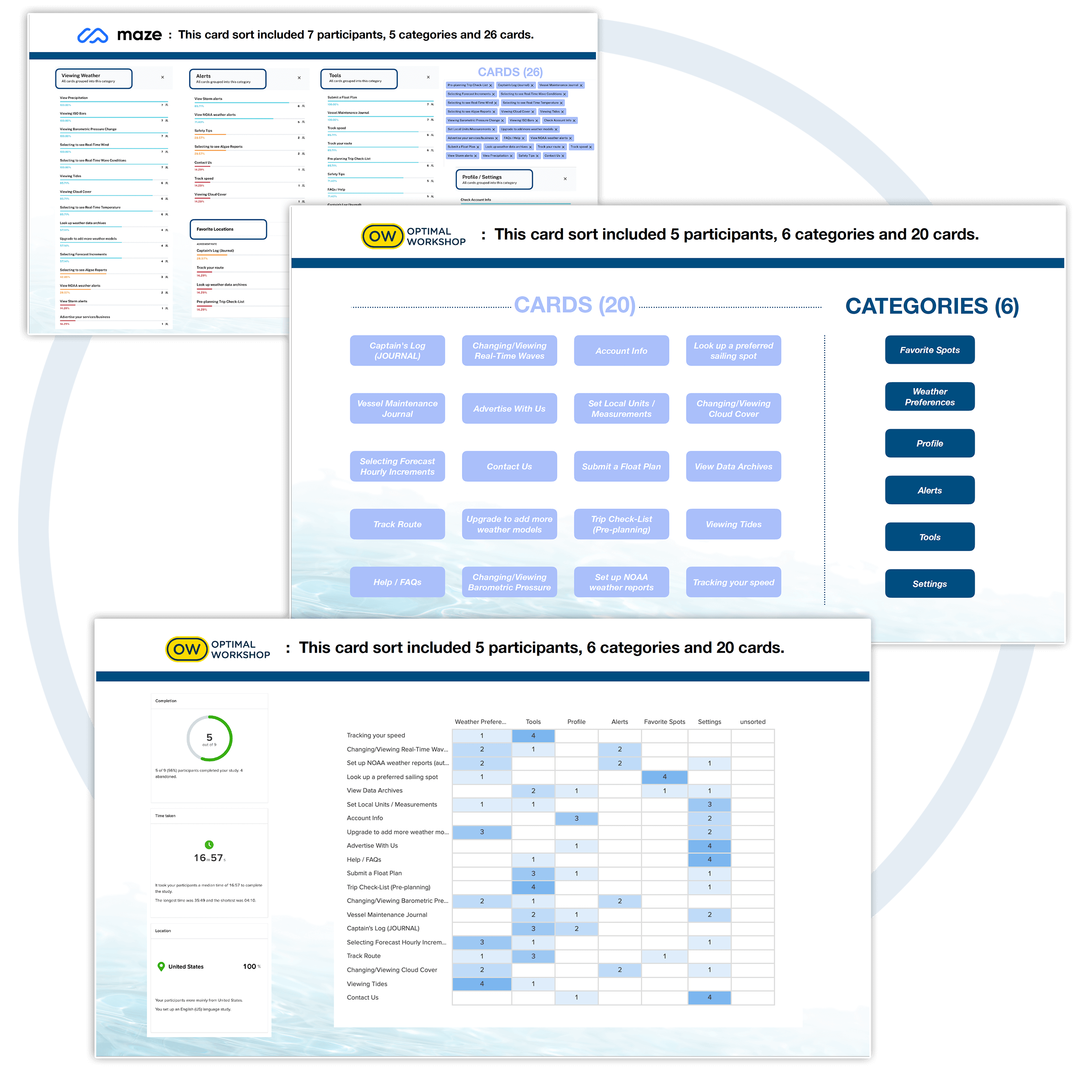
I initially conducted a "closed card sort" in maze.co which included 7 testers, and a five (5) categories. And then ended up conducting another test using OptimalSort.com, using six (6) categories.
I learned that wording for both categories and cards is critical to how users sort cards. I also learned that users might be looking for access to a key feature from more than one category/page.
Card Sort Results
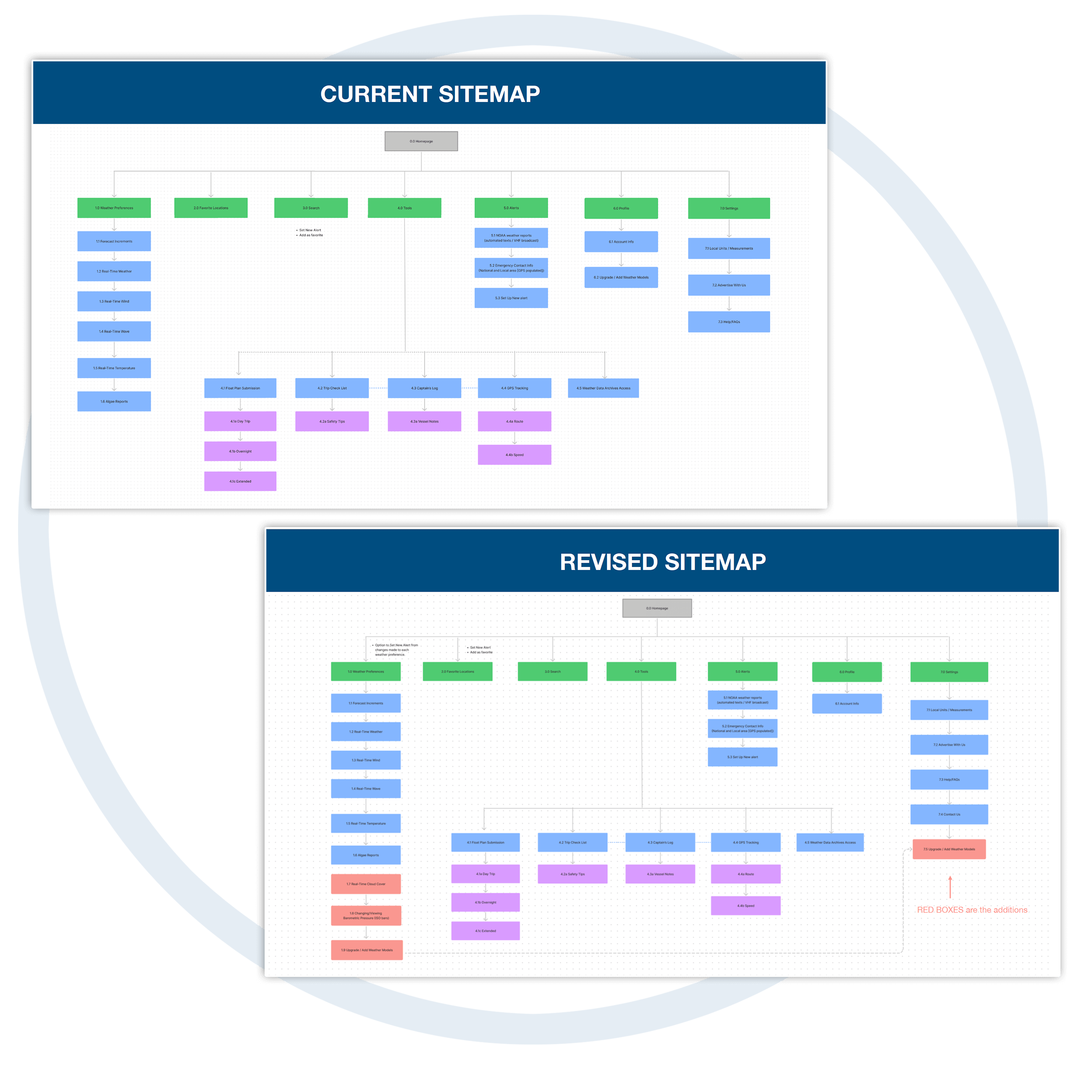
As noted from Card Sort results, I realized some areas cross over or overlap, so having access to do certain things (e.g. set weather alerts), might need to be accessed from the “WEATHER PREFERENCES” section as well as the “ALERTS” main section.
So I re-evaluated Site Map wording in some areas, and access to pages that need to cross reference each other.
To envision the process and emotion a user goes through to accomplish a goal, we create User Journey Maps. These journeys paint a visual story of the "thinking process" our personas will work through in order to accomplish a goal.
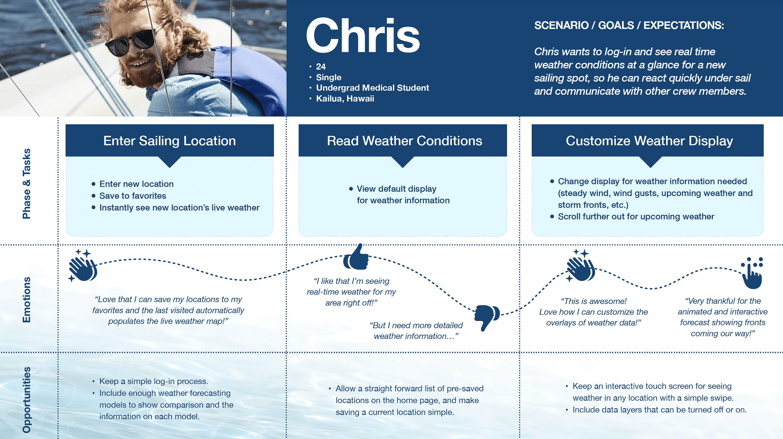
“Love that I can save my locations to my favorites and the last visited automatically populates the live weather map!”
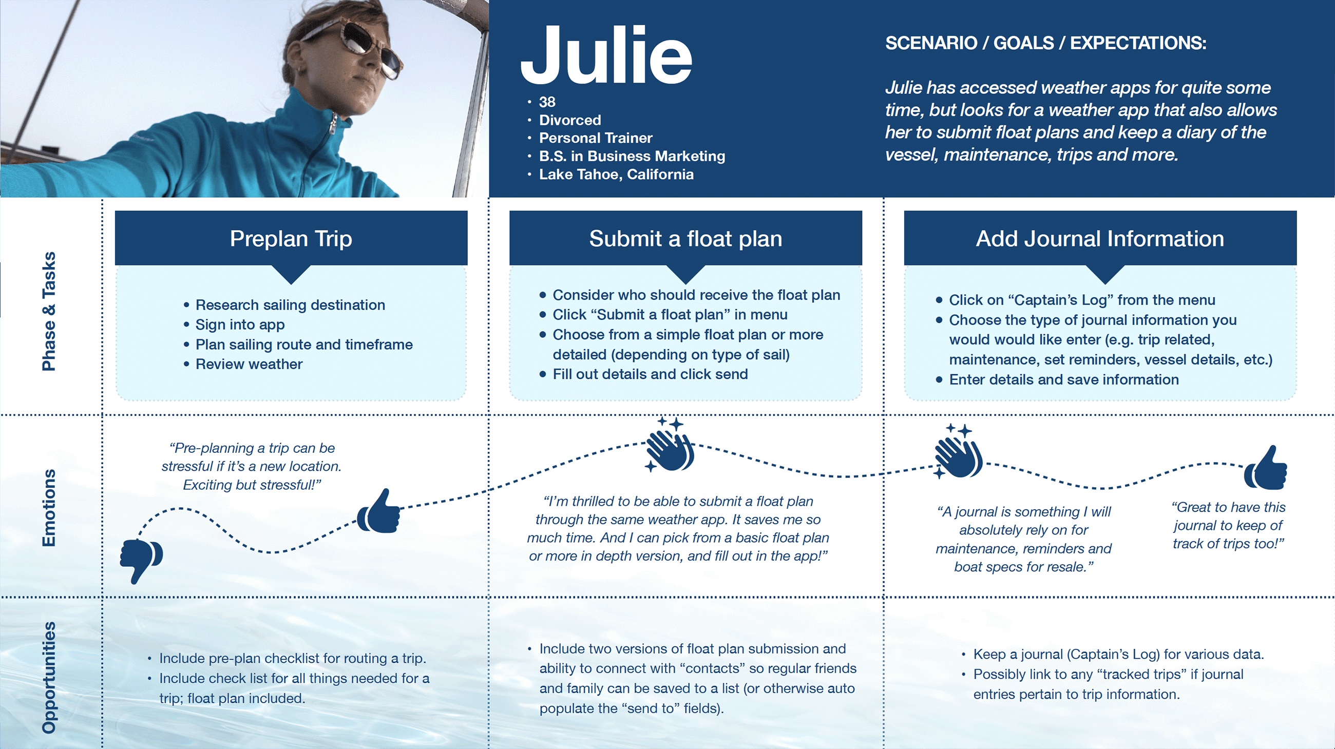
“I’m thrilled to be able to submit a float plan through the same weather app. It saves me so much time. And I can pick from a basic float plan or more in depth version, and fill out in the app!”
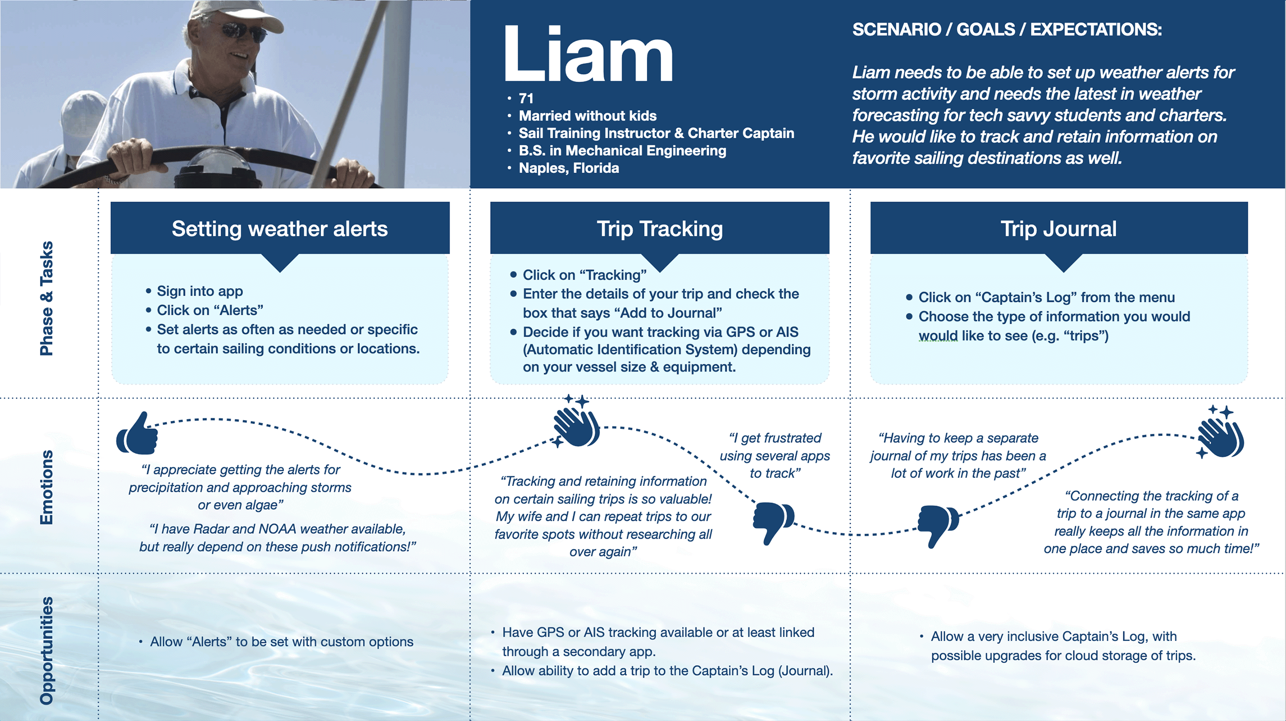
“I have Radar and NOAA weather available, but really depend on these push notifications!”
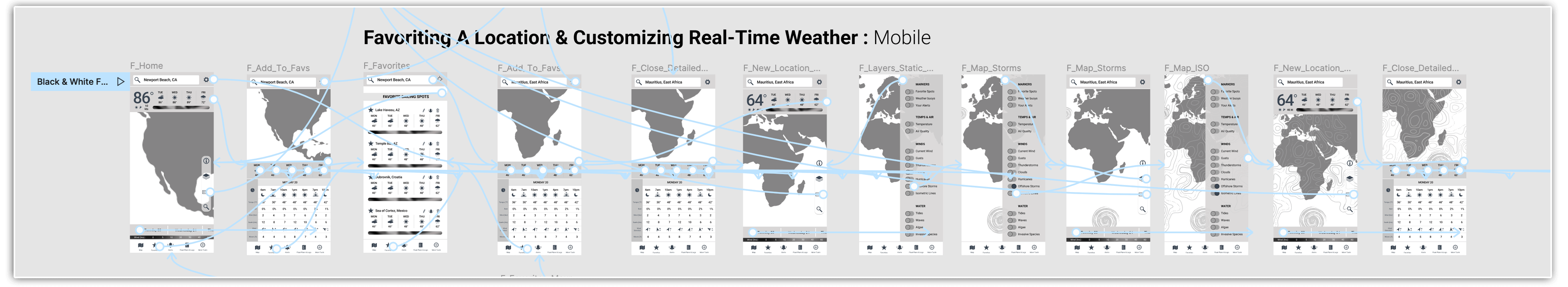
To better understand and accommodate our personas’ interaction within an application, we diagram User Flows; a map of pages the visitor must interact with to achieve a goal on a given website or application. Concentrating on this user interaction rather than individual pages helps keep the focus on the users’ point of view. It's also the groundwork for the information architecture phase.
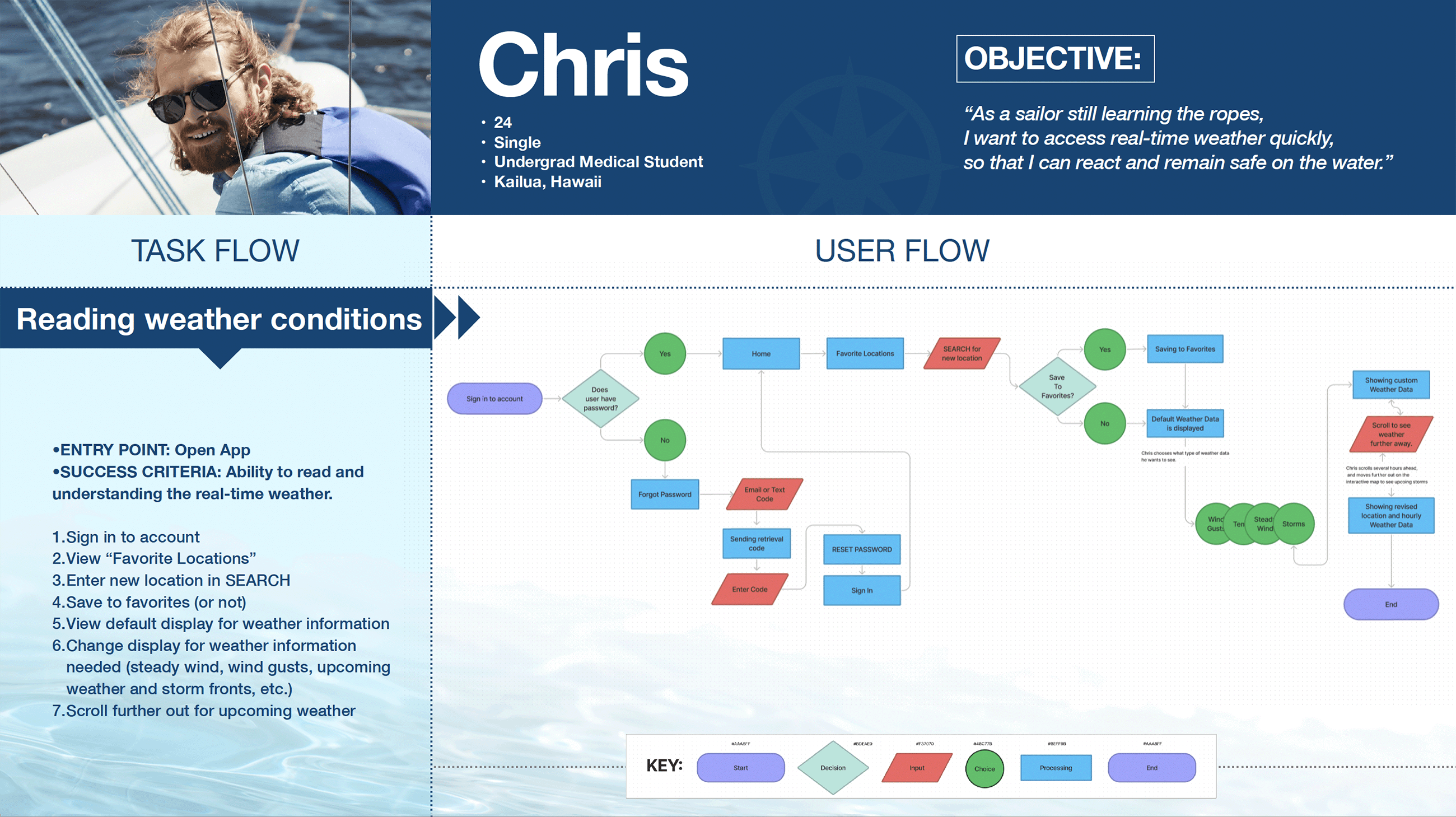
•ENTRY POINT: Open App
•SUCCESS CRITERIA: Ability to read and understanding the real-time weather.
•ENTRY POINT: Open App
•SUCCESS CRITERIA: Successfully and easily able to submit a float plan.
•ENTRY POINT: Open App
•SUCCESS CRITERIA: Seeing alerts
PROTOTYPE |
To quickly structure a visual representation of an interface, we begin by sketching out low-fidelity Wireframes on paper. Once reiterated in mid-fidelity, we create high-fidelity wireframes - which convey how the polished app will look, feel, and function.
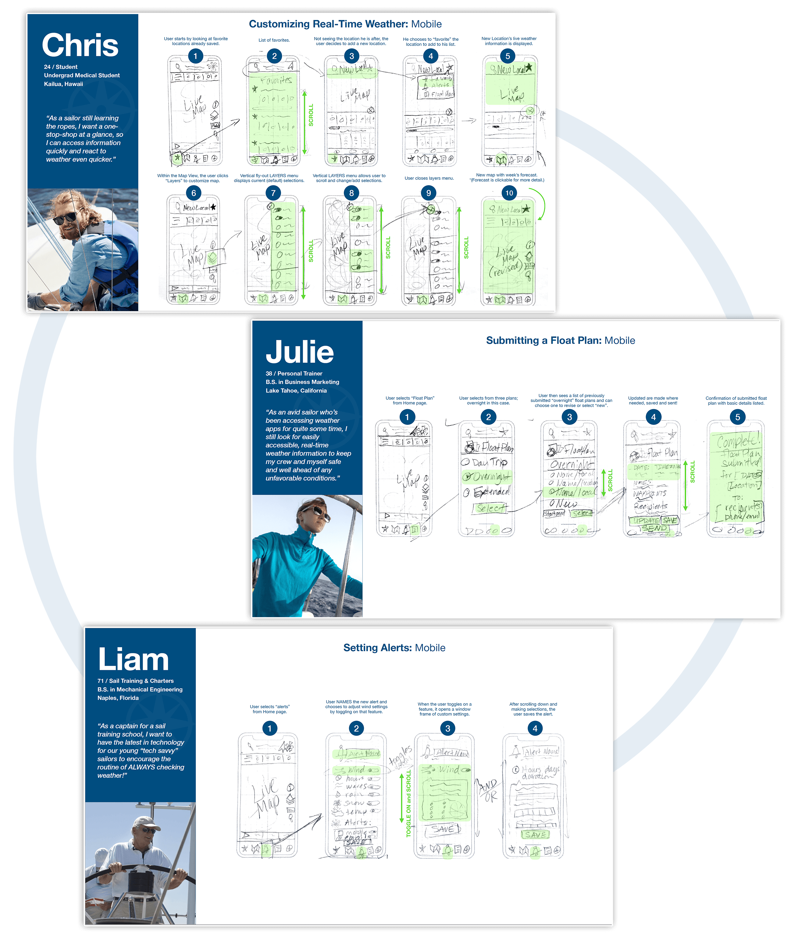
Starting with low-fidelity wireframes is a crucial step as it allows me to focus on the core structure and navigation alone. The quick sketches highlight only the high-level functionality of the design and help me avoid getting caught up in layout and UI details.
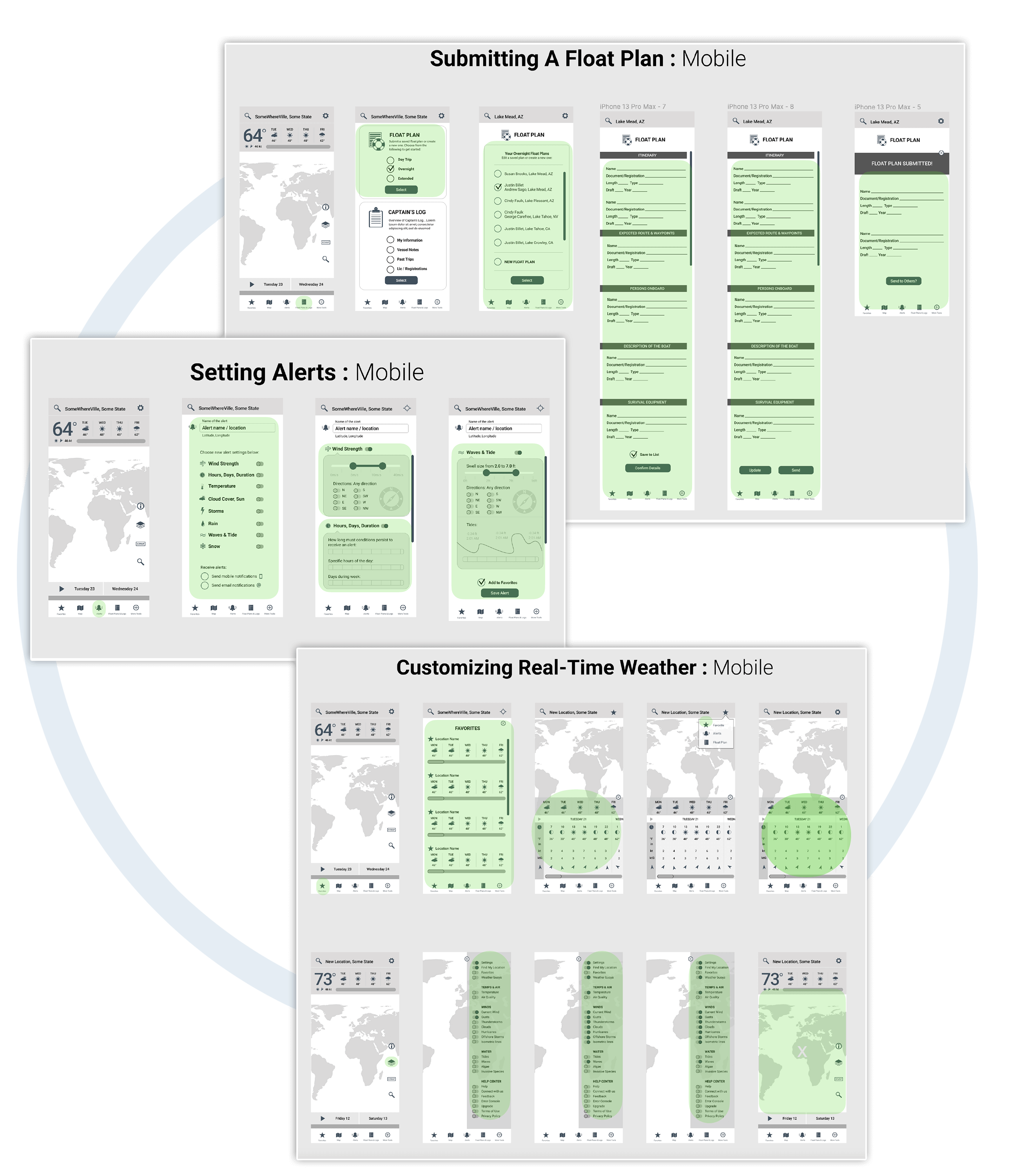
Here we reiterate and portray a bit more detail with digital prototypes, but they're not as polished as high-fidelity prototypes. Sharing and getting feedback becomes easier with these digital wireframes.
These high-fidelity prototypes generally take much longer to create as the goal is to flesh out every single detail of a design. They should look and feel like a live system in terms of graphics, spacing, and layout and closely resemble the finished product.
To understand the interactivity between functional elements, we create Prototypes from the high-fidelity wire frames. The purpose of the prototype is to allow both stakeholders and "usability testers" to click around in the application and get a sense of how it will feel and function once it’s completed. This initial prototype is in grayscale, as we are using high-fidelity wireframes (no color or final imagery). Click below for interactive version.
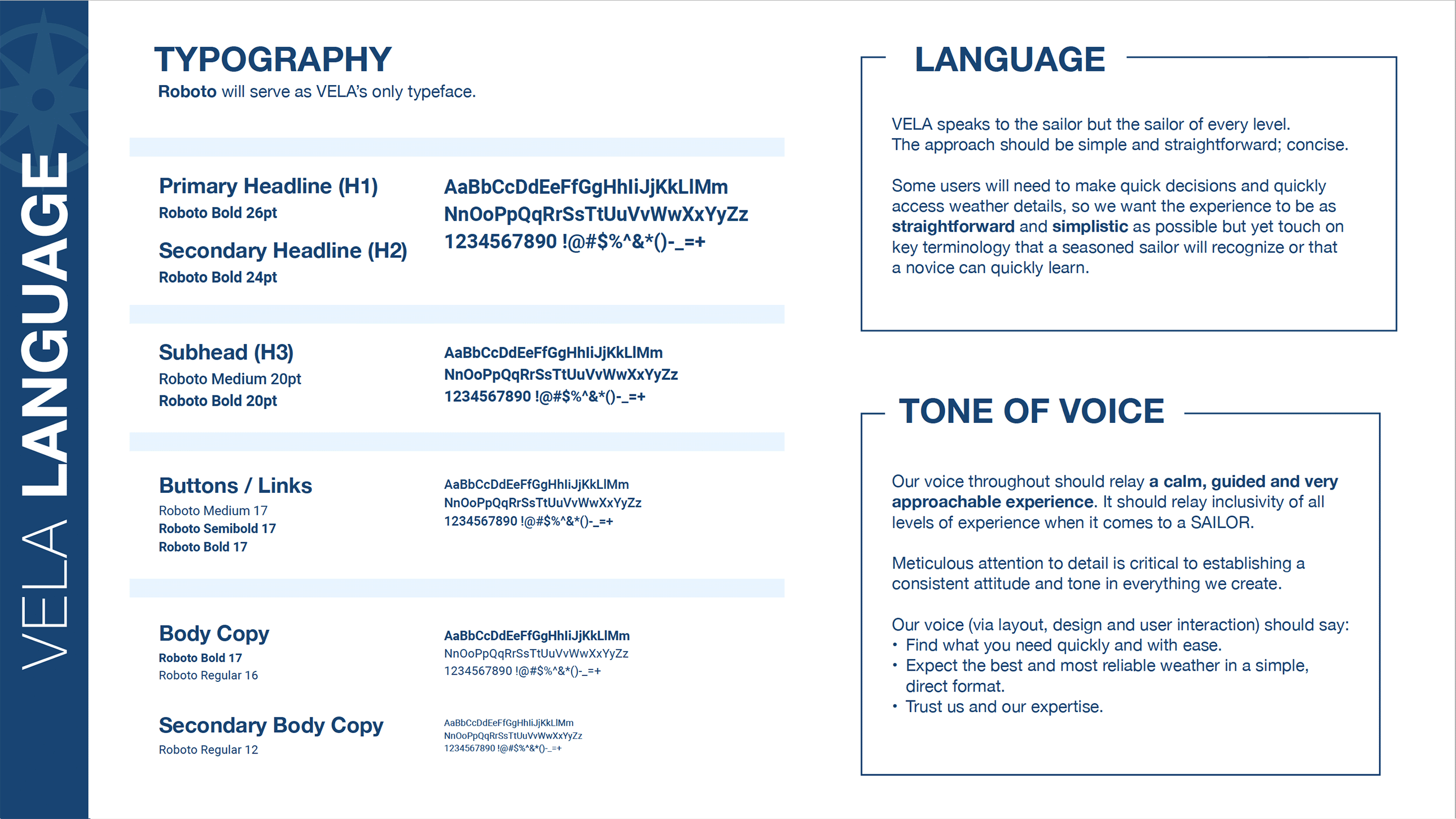
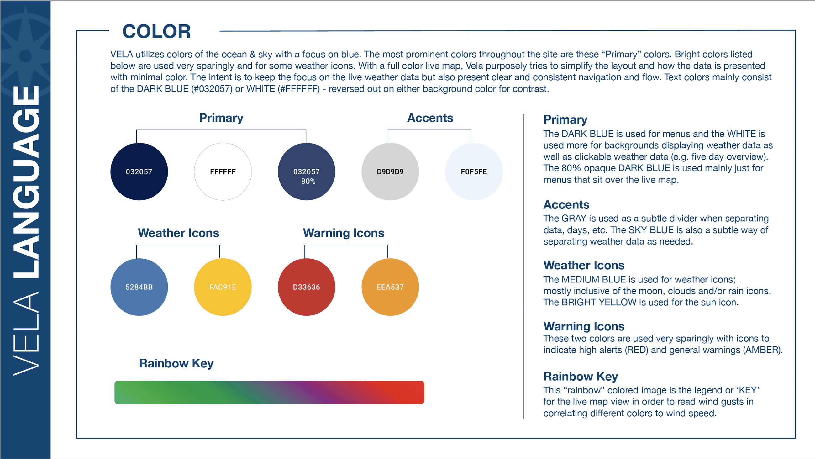
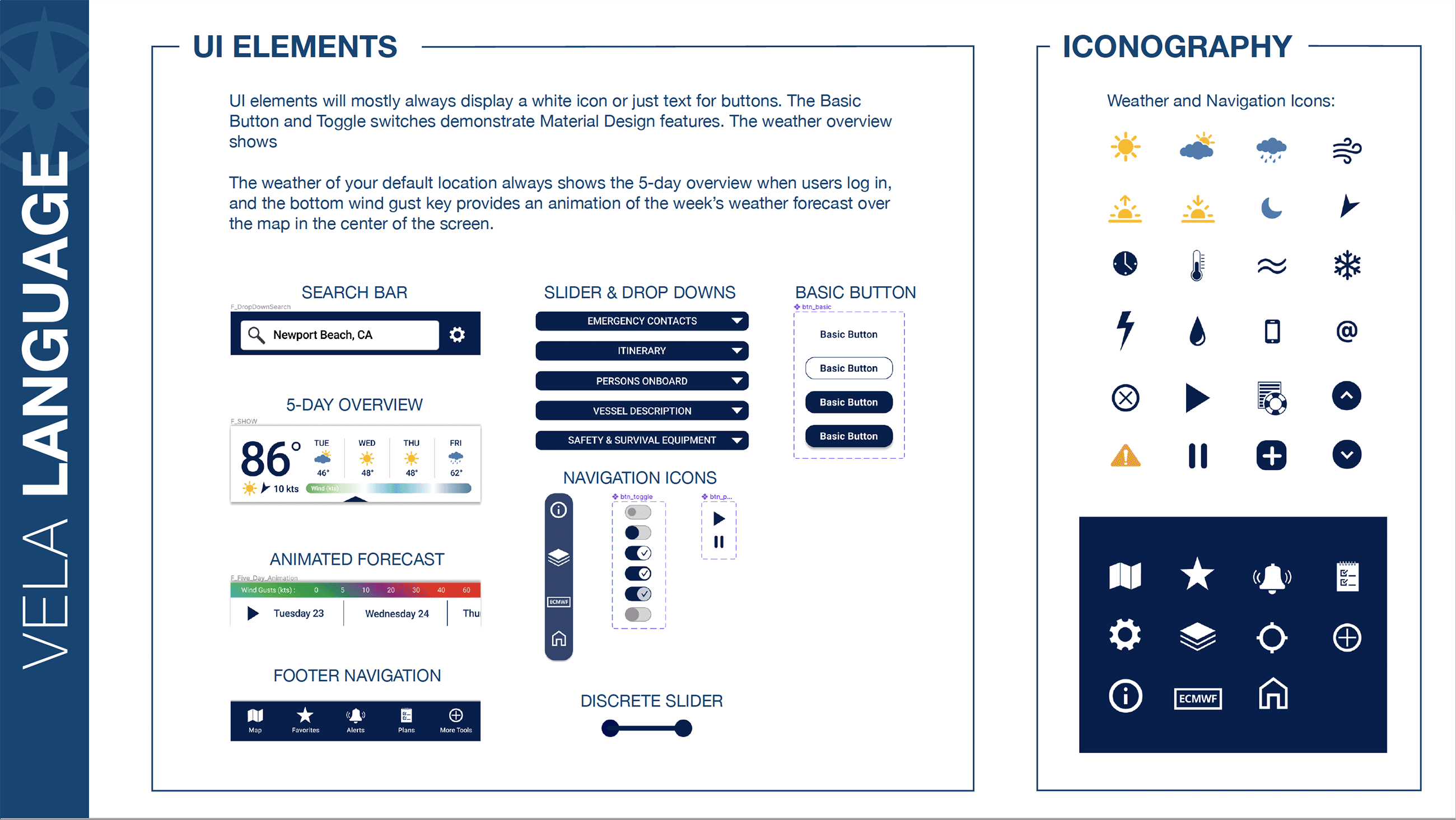
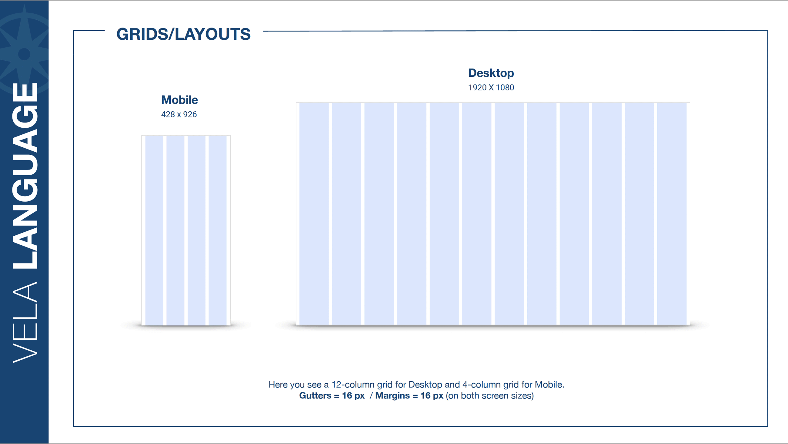
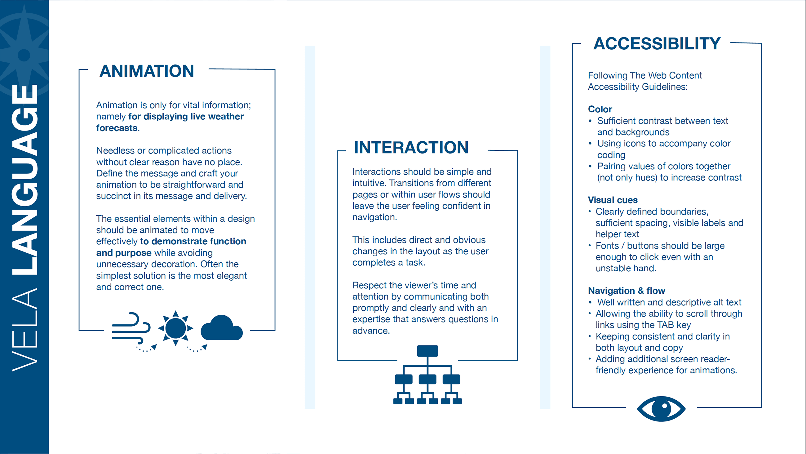
I create a Style Guide to help communicate my design with anyone on my team, others who might be working on a project or even stakeholders. The intent it to provide a solid reference with indepth detail of the design, language and imagery used inorder to adhere to branding standards.

TEST |
To begin the user testing process we outline goals, test objectives and logistics all within a Usability Test Plan …as well as create a script to kick-off our interviews. We also clearly lay out our tasks, create a scenario to help the user understand the context of what is being asked of them and include some follow-up questions. I also do some Peer Reviews and Preference Testing at this stage in the design process.
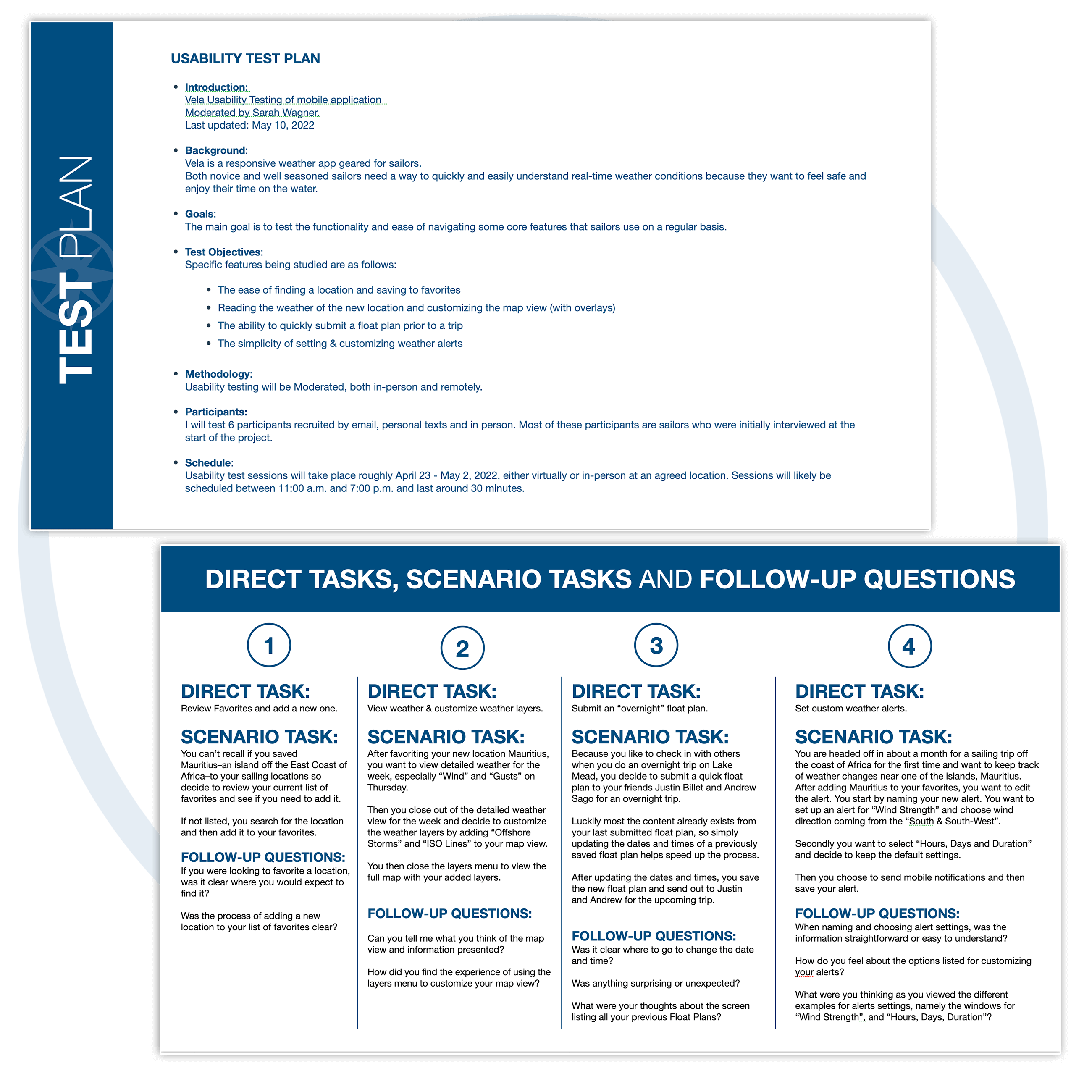
Geared toward gathering evaluative data, the test plan provides a brief overview of the appliction background, goals, test objectives, methodology, participants and schedule.
From there I breakdown the testing itself into Direct Tasks, Scenario Tasks and Follow-up Questions.
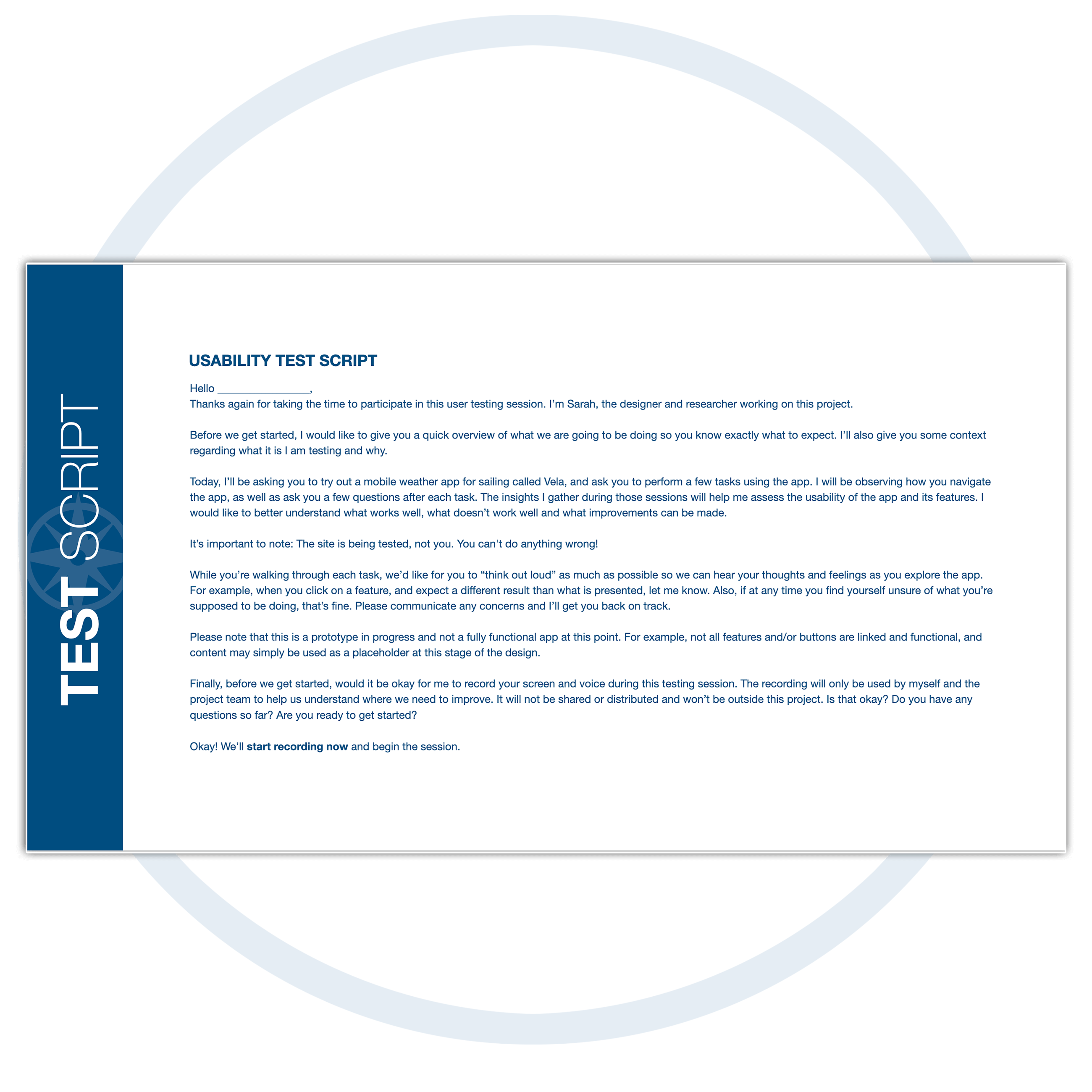
This script is created to provide a routine, verbal overview for each testing subject before launching the test. I begin by introducing myself, explain the app they will be reviewing, the testing process and ask for permission to record. I also reassure the participant that there are no wrong answers and encourage them to "think out loud".
From the inverviews, I begin to synthesis all the details. To isolate information, discover patterns and group information to reveal common concepts, I sort through our user interview data with Affinity Mapping along with a Rainbow Spreadsheet to visually relay common patterns and possible solutions.
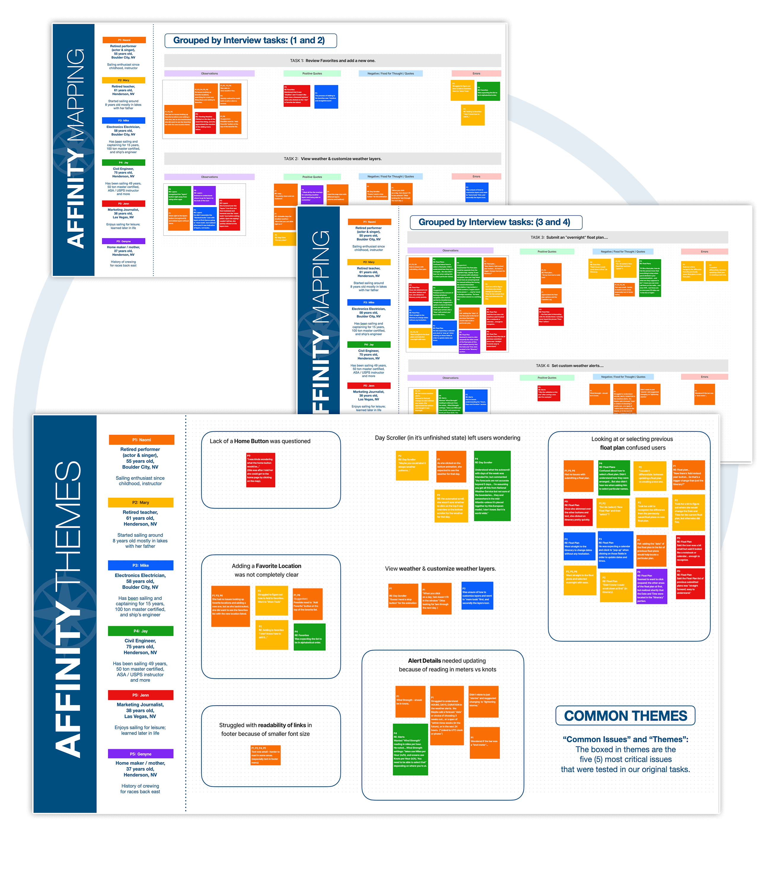
In this process I start grouping all the information first categories of Observations, Postitive Quotes, Negative Quotes and Errors, color coding based on the interviewee. From there I begin affinity mapping by finding common issues and themes, eventually creating a hierarchy of the most critical issues.
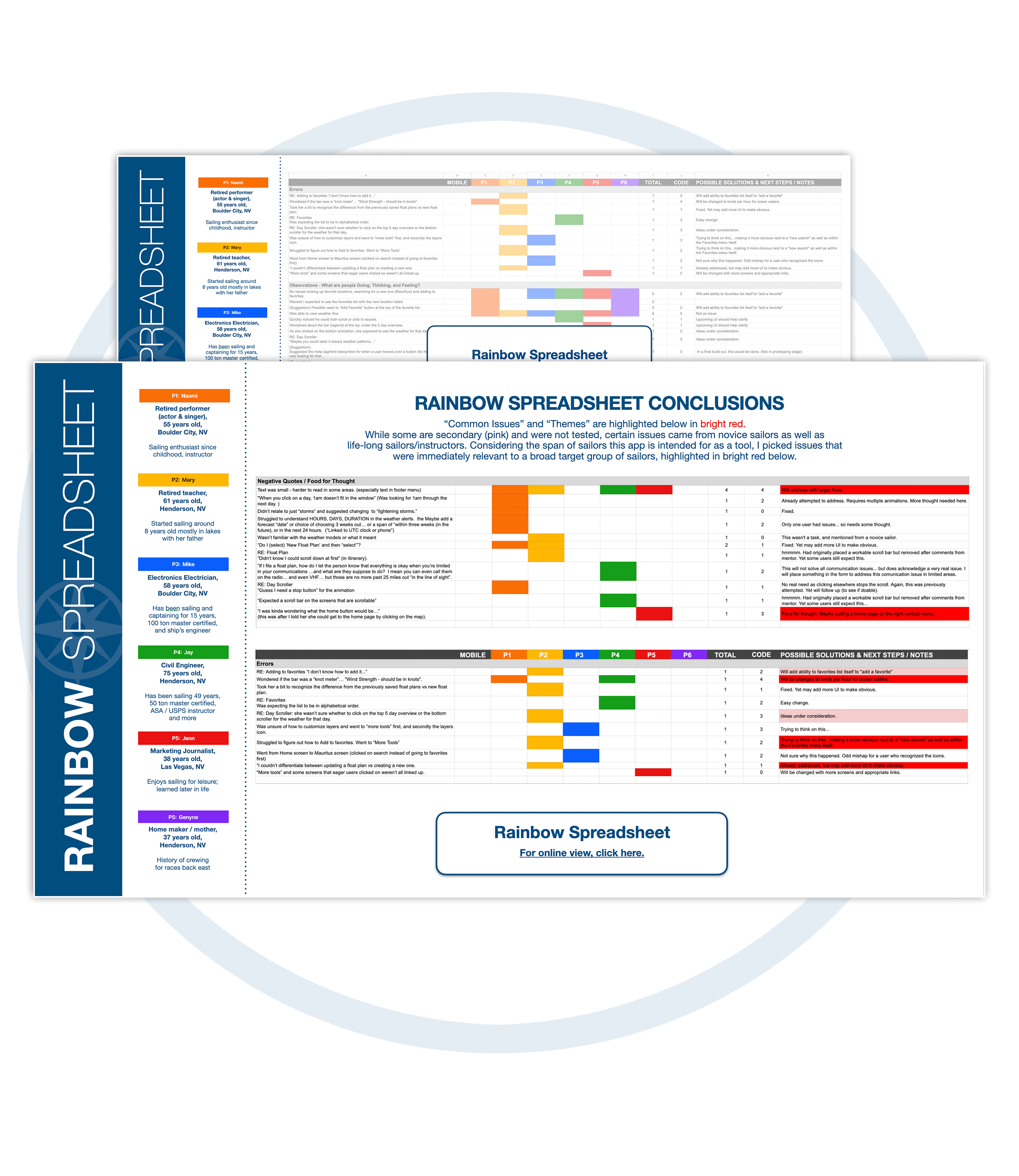
In this spreadsheet I lay out every detail in the same categories of Observations, Postitive Quotes, Negative Quotes and Errors, notating how many test subjects had the same concern. I also make note of the severity of the problem and begin to consider possible solutions and next steps to resolve each issue.
I definitely came across unexpected problems with an array of different testers. I found that their experience with weather apps and apps in general all validated some of the issues that came up. There were also accessiblity issues (namely smaller fonts) that my older testers weren't able to clearly read. Different sections of the app and icons needed some rethinking as well, which again related to similiar weather apps that testers were familiar with. Overall, most testers did just fine with the tasks and provided some very insightful feedback.
Access more than one app for weather models
Wanted to save their favorite locations
Wanted a digital Float Plan and Journal for vessel maintenance
Wanted custom alert settings
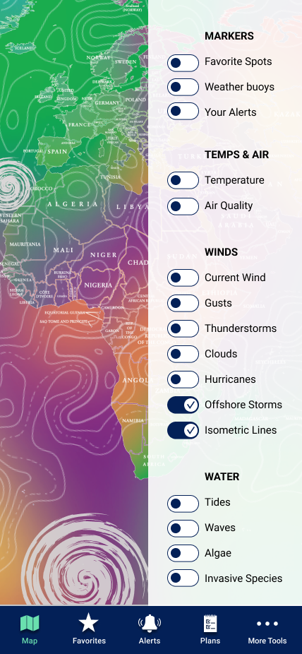
Wanted interactive maps
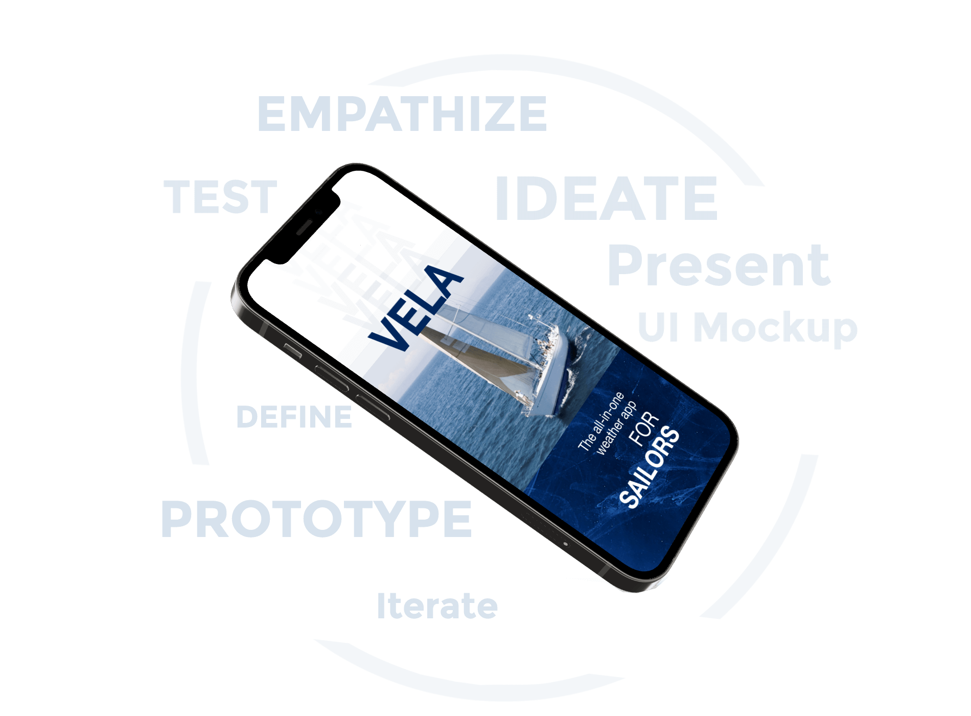
UI MOCKUP |
Working towards presentation to stakeholders and eventually hand-off to developers, I refine the wireframes and finalize the clickable prototype. Incorporating design principles and theory, I also create a Style Guide to clearly lay out the brand and language that should be used throughout implementation. See below for an overview and a link to the live prototype.
Copyright © 2023 Color Driven - All rights reserved.