Petzlover Redesign
UI Project Overview
Petzlover.com is an online marketplace for selling and buying a variety of pets. Its world-wide database allows users to pick their location and language and create ads for free as well as upgrade to access premium features.
WHY the redesign? The intent is to update the UI and make the searching more intuitive and visually engaging to overcome some cumbersome menus and stagnant icons in navigation as well as the darker, heavier feel of the color palette used.The redesign will also provide filters for those searching to adopt from a broader range of sources (shelters/rescues) or simply search breeders alone. And lastly, the intention is to create an engaging, responsive site for all devices.

My Role:
- UI Designer
- Branding Design
- Design Strategy

UI Techniques:
- User Persona
- User Flow
- Mood Board
- Style Guide
- Wireframing and Prototyping
- Device Mockups

Tools & Software:
- Figma / Figjam
- Photoshop
- Illustrator
- Dreamweaver
- Keynote

Time Line:
- Two Months
THE FULL PROCESS:
 ........
 ........
 ........
 ........

(CLICK ON A STAGE ABOVE TO GO DIRECTLY THERE)
EMPATHIZE |
WHAT is the Product? It's an online, world-wide market place for buying or selling a pet. It's ad-free and doesn't require a user to sign-up in order to buy a pet or create an ad. Certain features (communication with owners, etc.) are available with an upgrade.
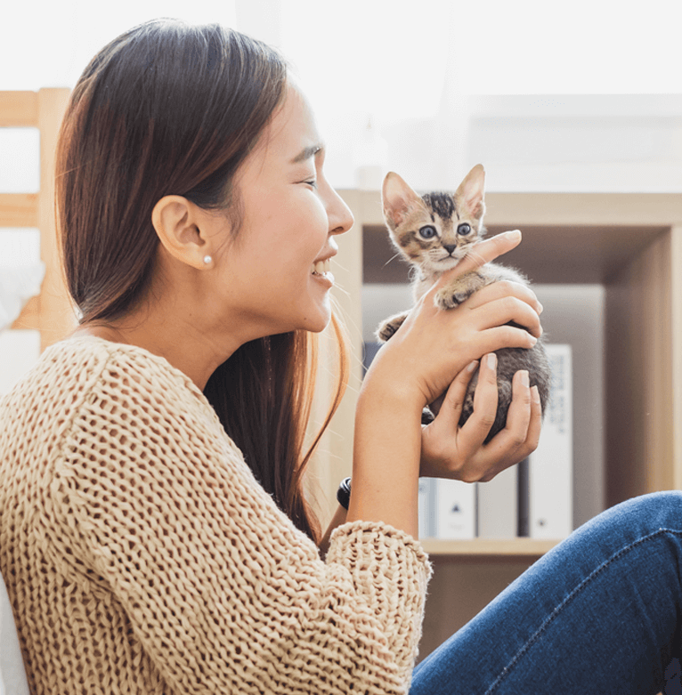
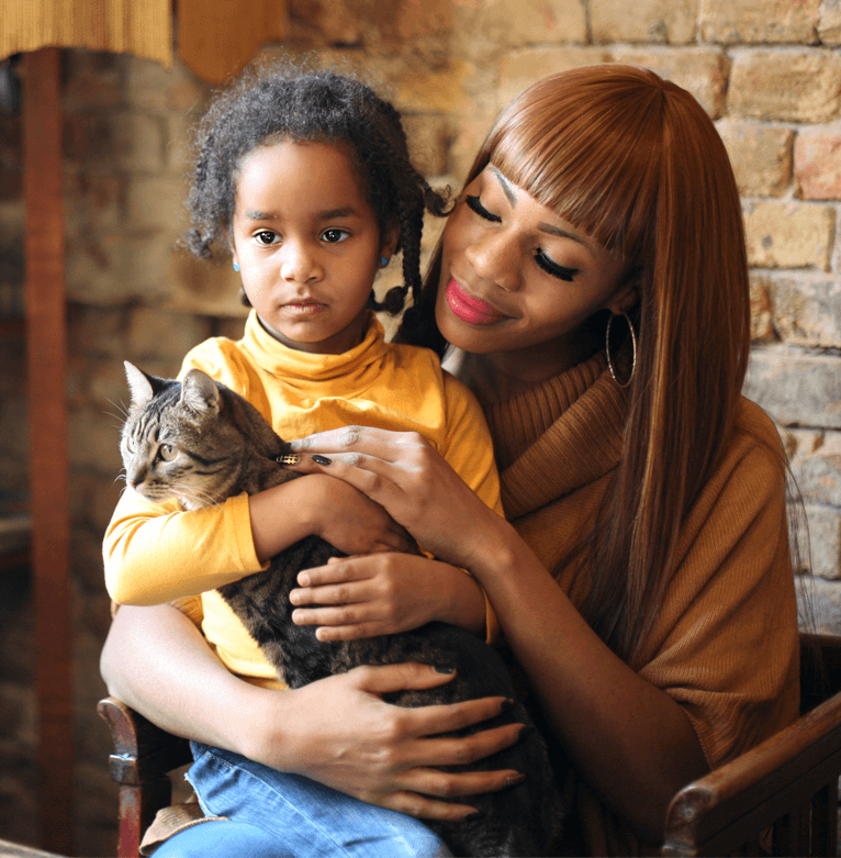
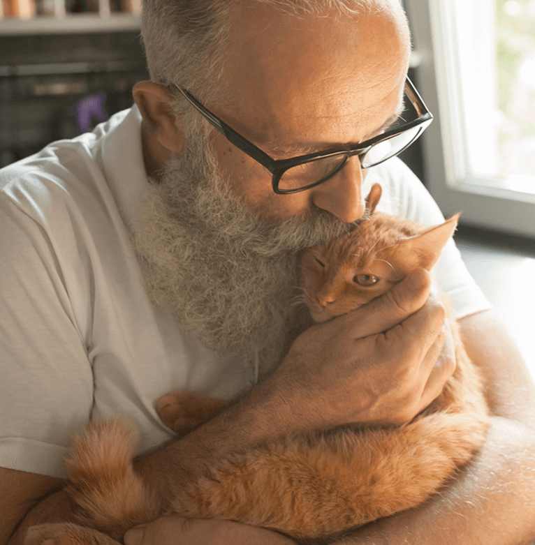
WHO would use it? Owners/breeders and shelters wishing to sell their pets as well as buyers looking for a broad search.
WHEN & WHERE would it be used? This site should be responsive and accessible on any device as buyers and sellers should get notifications at any point, and be able to respond quickly. Buyers and sellers will use this tool at home or on the go on any device. Users can search for pets anywhere, as long as they’re logged in on a device.
DEFINE
|
User Persona
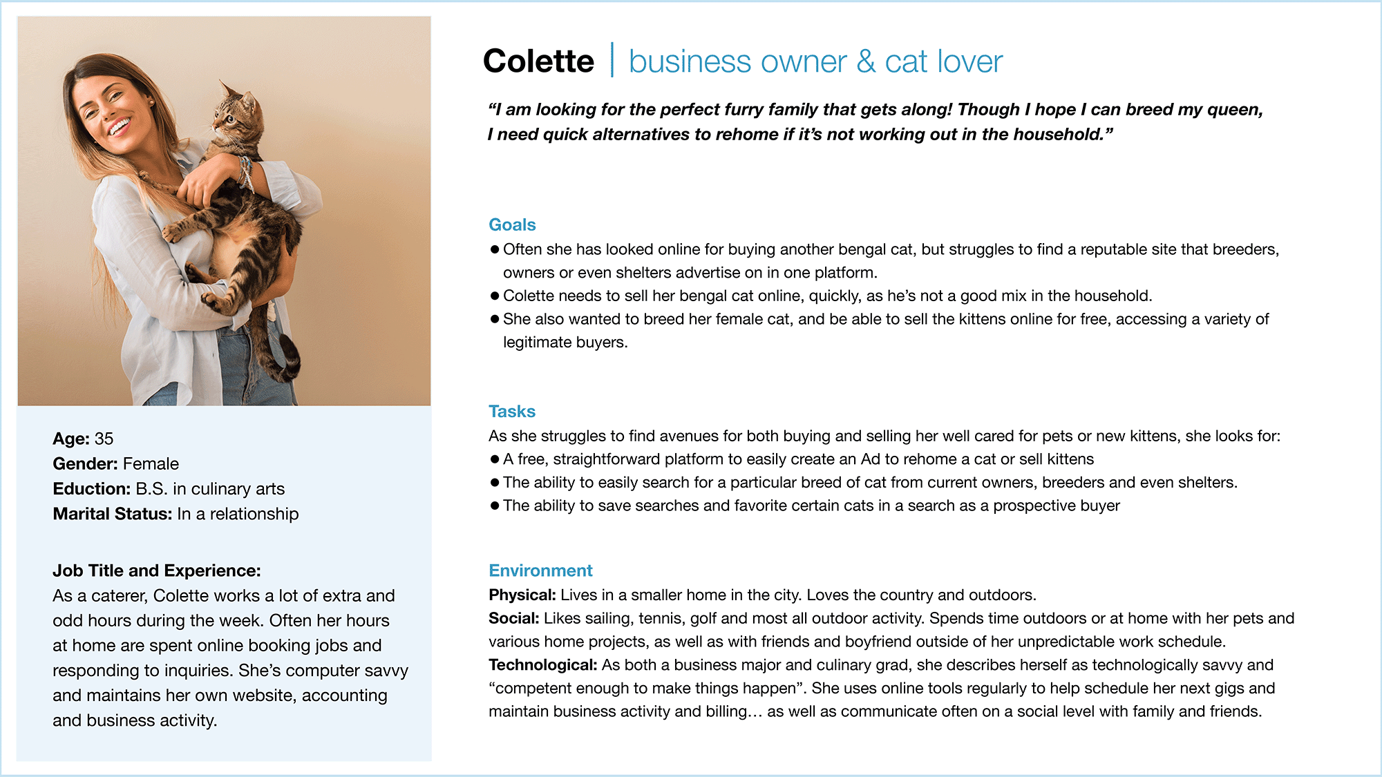
To better understand the users' goals, motivations and point points, I created a Proto Persona, based on information from breeders, pet owners and general comments found online via other pet sites. I created a hypothetical persona to portray the average users "Point of View". Meet our Persona, Colette:
IDEATE
|
User Stories
Pet lovers world-wide share common ground:
- Life happens with our furry, family members. Period.
- Breeders expect to sell to reputable pet parents quickly.
- People grieve the loss of their beloved pets and sometimes (often) begin a new search.
- New pets are adopted daily.
- Shelters are in desperate need to rehome.
- Owners want a free service to both buy and sell pets of all pedigrees, without hassle or extra fees.
- Pet owners and breeders want to know the new parents and environment are deserving of their fur babies... and often appreciate local sales/rehoming for that reason.
"I am looking for kittens from a breeder, and would like to only search breeders from a reputable site."
"I need to sell my cat quickly, and need a reputable site that both owners and breeders advertise on often… without all the ads."
"My cat just had a litter and I want to sell my Bengal kittens locally to someone I meet in person. I need a free, easy way to advertise."
"I am ready to look for a new cat after losing my sweet darling after 13 years. How can I search breeders, owners and rescue sites… all at once? I don’t want to search a million different sites."
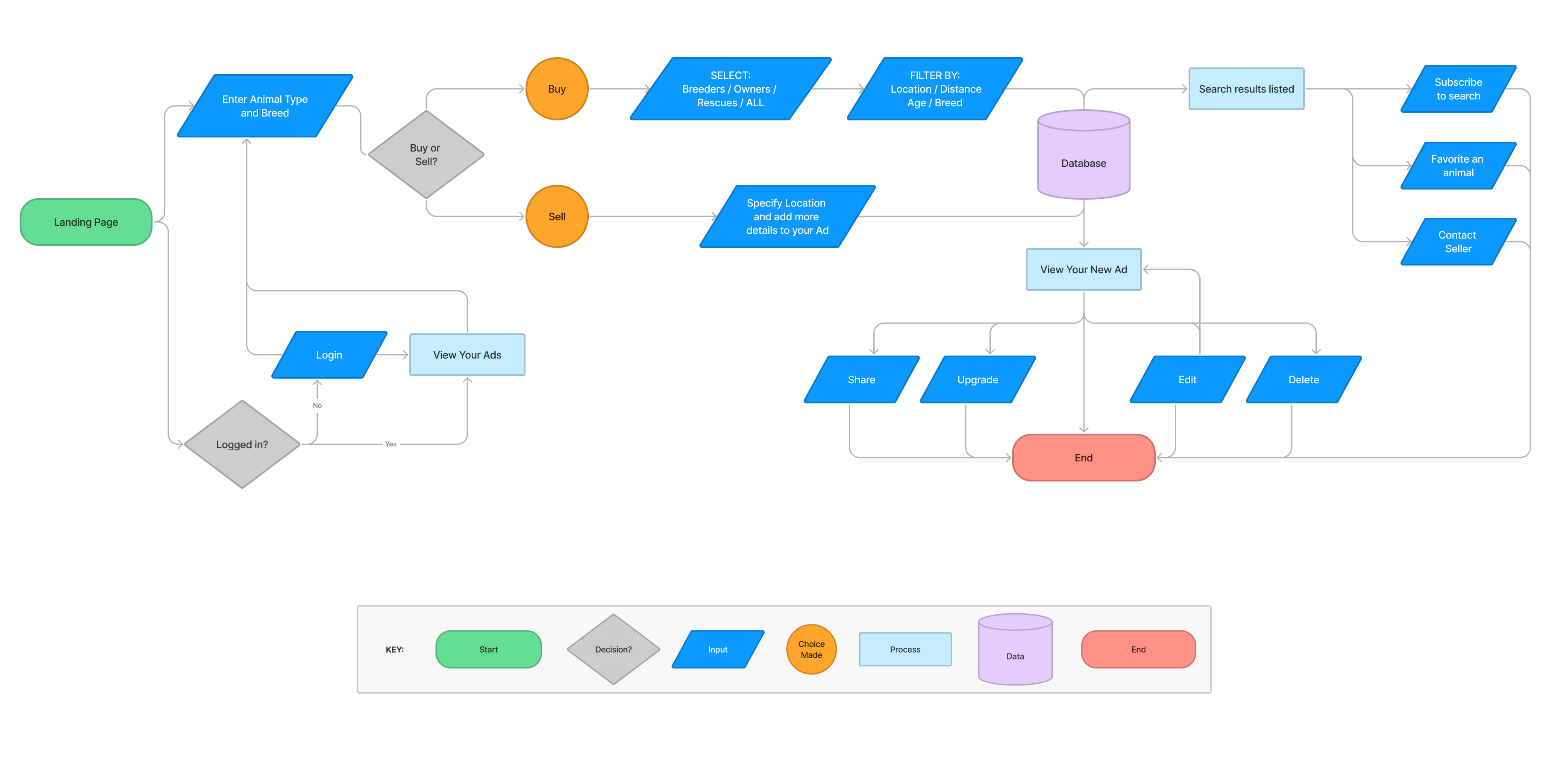
User Flows
To better understand and accommodate our personas’ interaction within an application, I diagram a User Flow; a map of pages the visitor must interact with to achieve a goal on a given website or application. Concentrating on this user interaction rather than individual pages helps keep the focus on the users’ point of view. It's also the groundwork for the information architecture phase. Key flows include:
- Logging in
- Searching for a new pet (buying)
- Creating an Ad for your pet (selling)
- Reviewing your current Ad(s)
PROTOTYPE
|
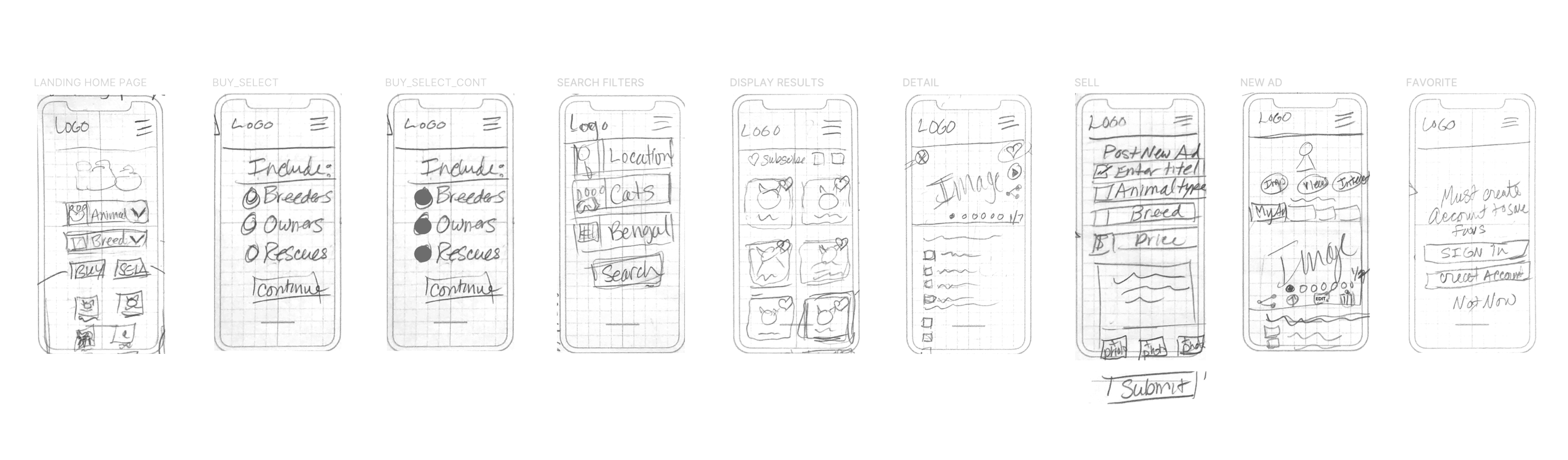
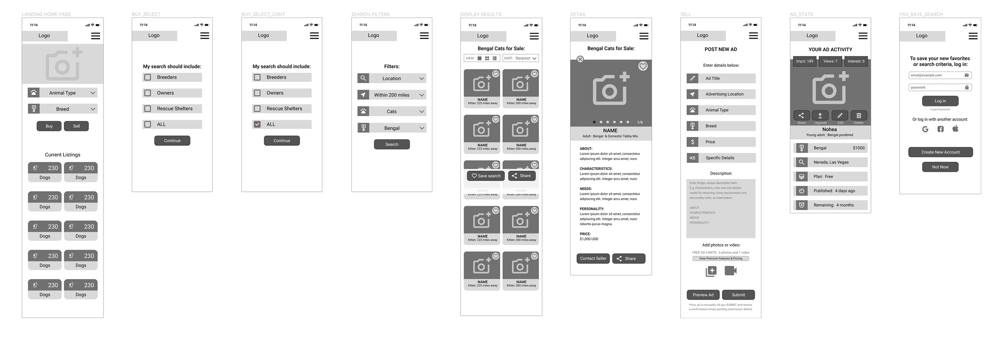
Low & Mid-Fidelity Wireframes
VISUALIZE
|
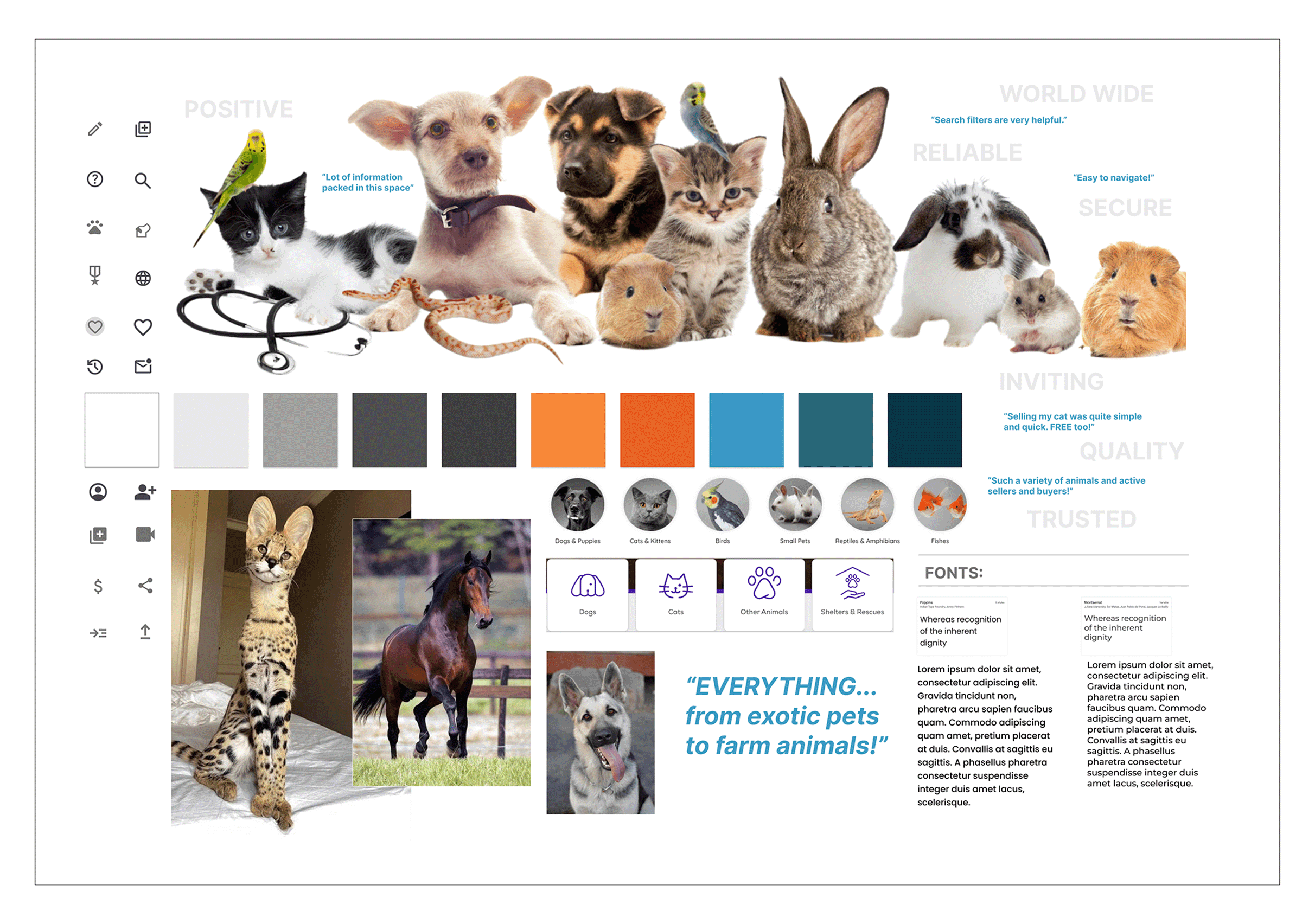
Mood Board
As a starting point, I created a mood board–an artboard showing a collection of inspirational images and design elements–to convey a mood and visual direction. Key words, color chips and icons also help relay the tone and overall voice as I progress with more refined designs.
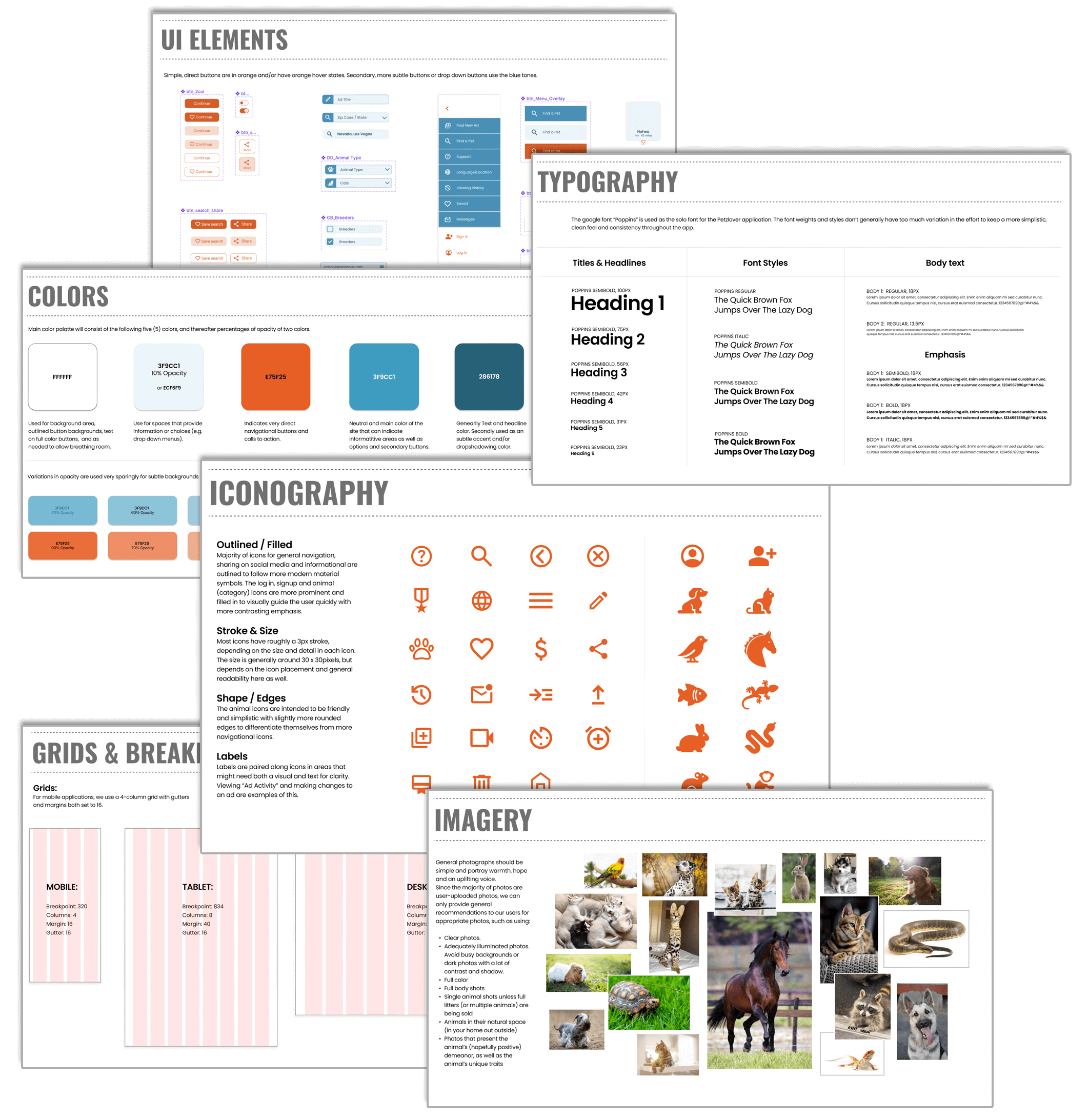
Style Guide
To really define the look and feel, I created a Style Guide to help communicate my design with anyone on my team, others who might be working on the project or even stakeholders. The intent it to provide a solid reference with in depth detail of the design, language and imagery used in order to adhere to branding standards.
High-Fidelity Wireframes
These high-fidelity prototypes generally take much longer to create as the goal is to flesh out every single detail of a design. They should look and feel like a live system in terms of graphics, spacing, and layout and closely resemble the finished product.
ITERATE
|
Before & After Snapshots
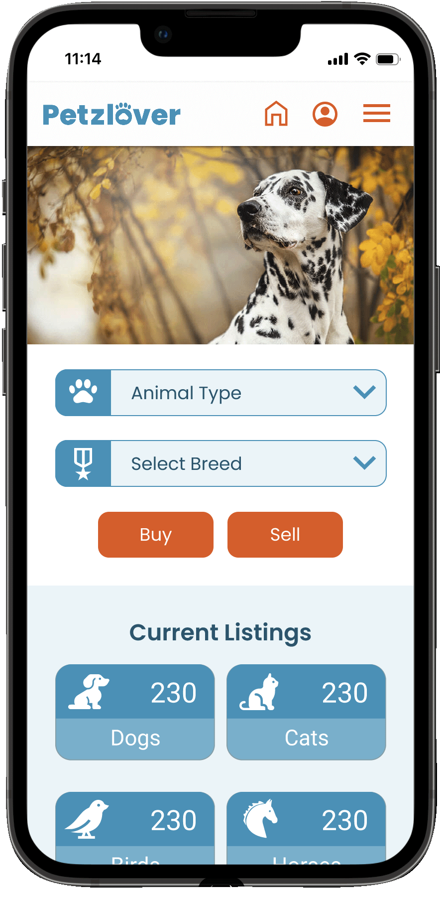
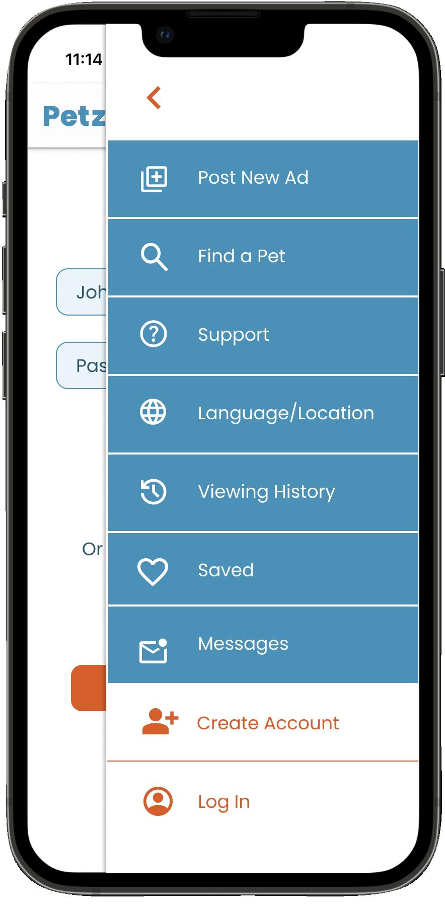
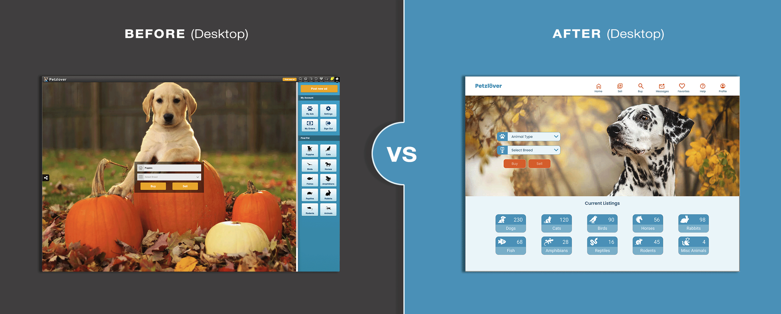
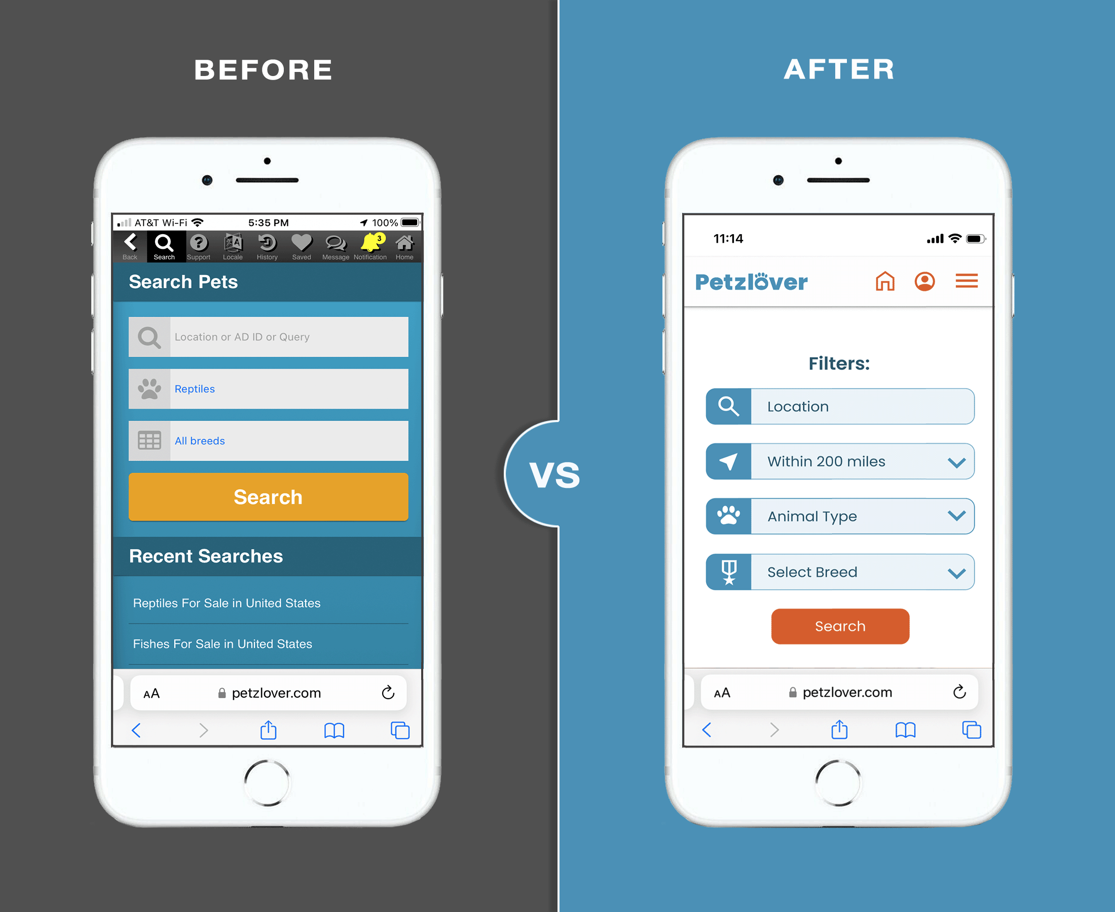
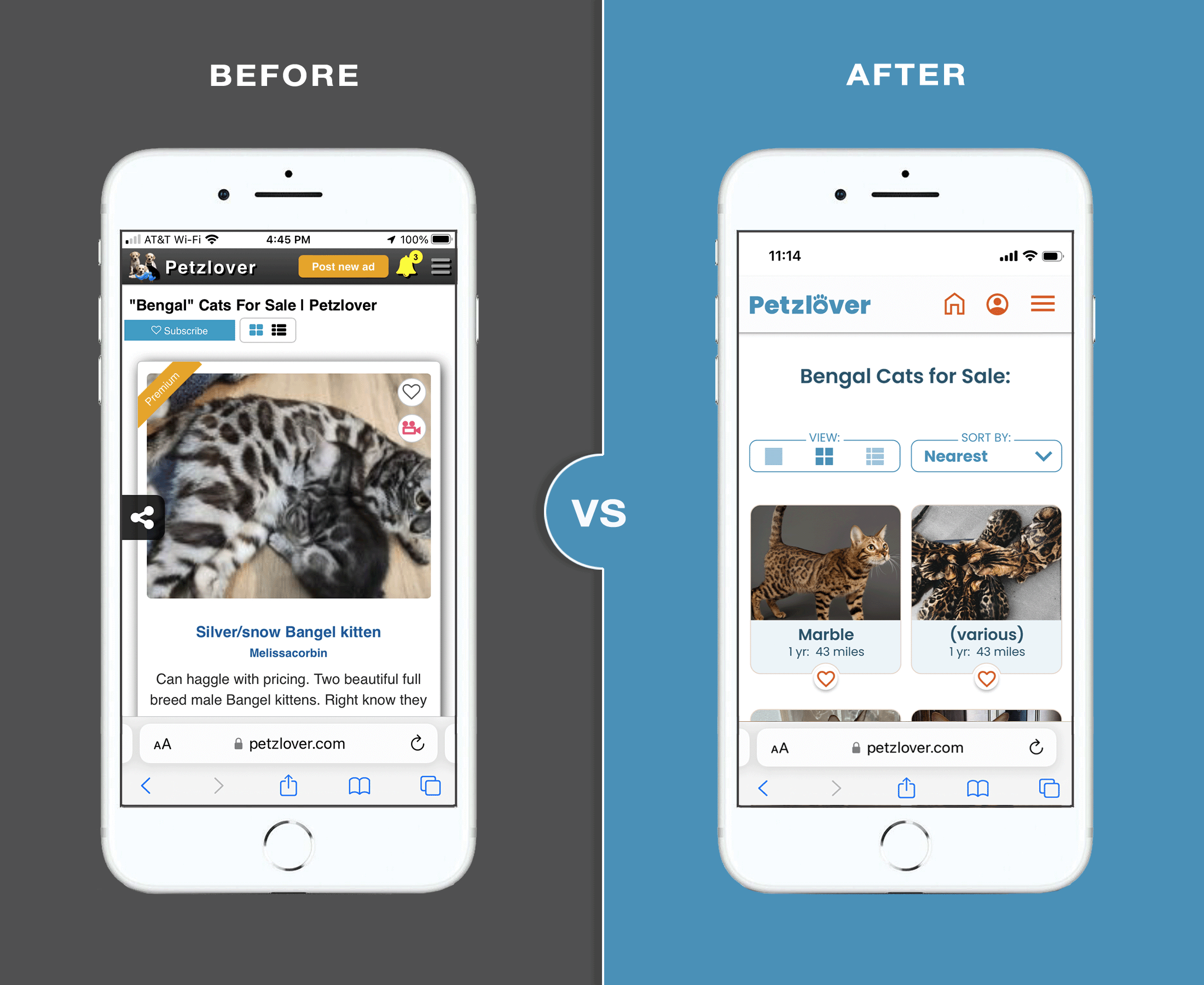
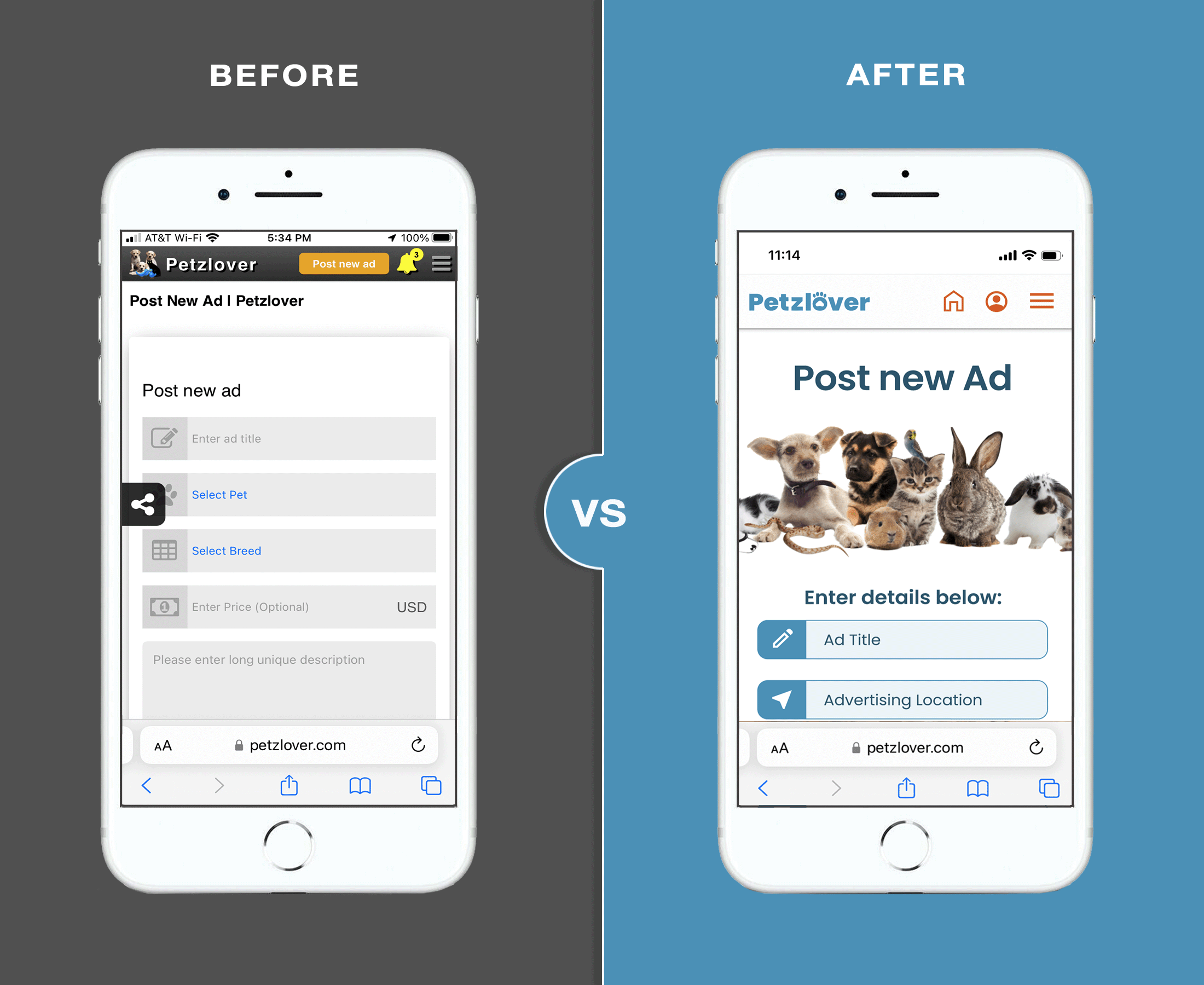
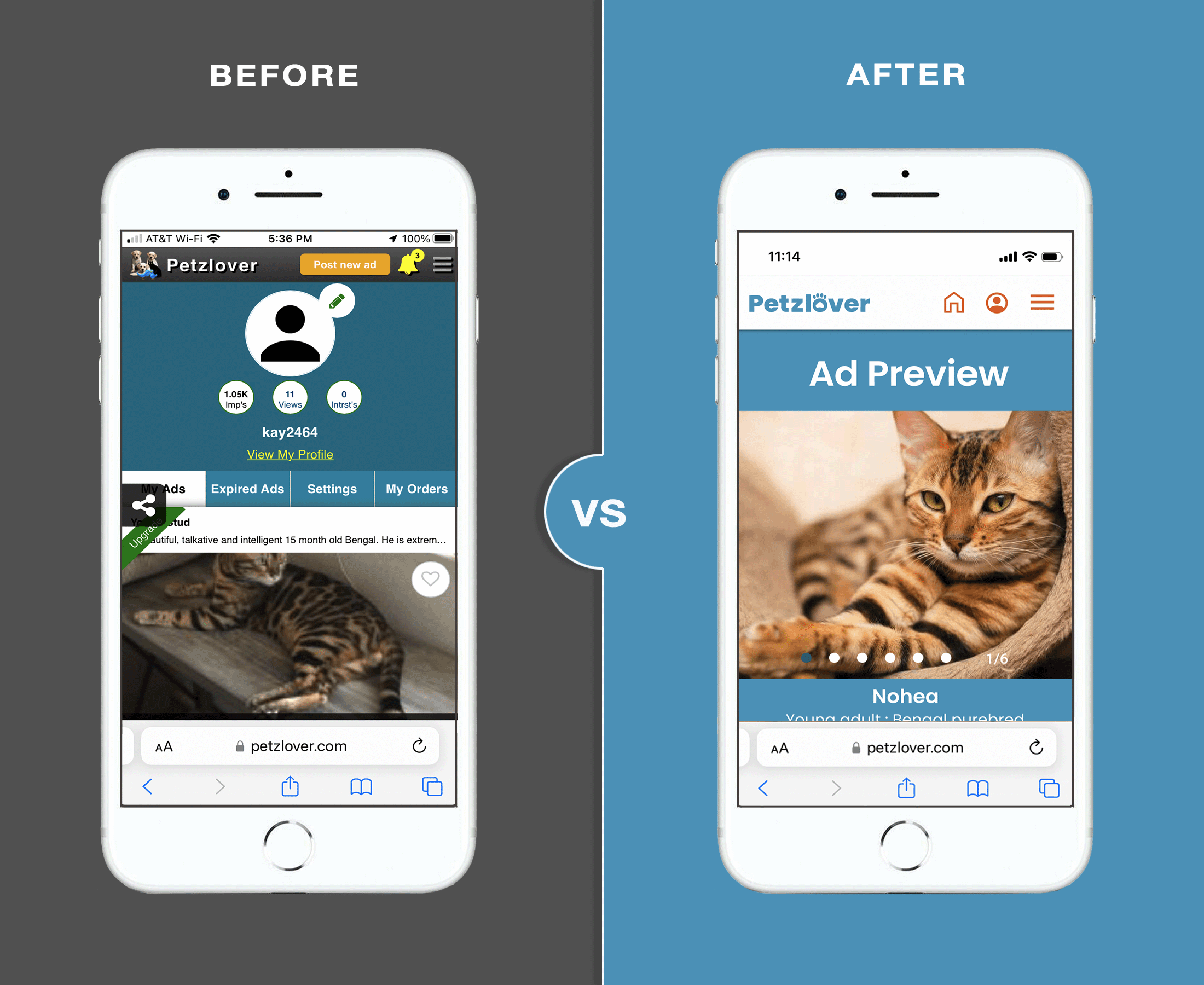
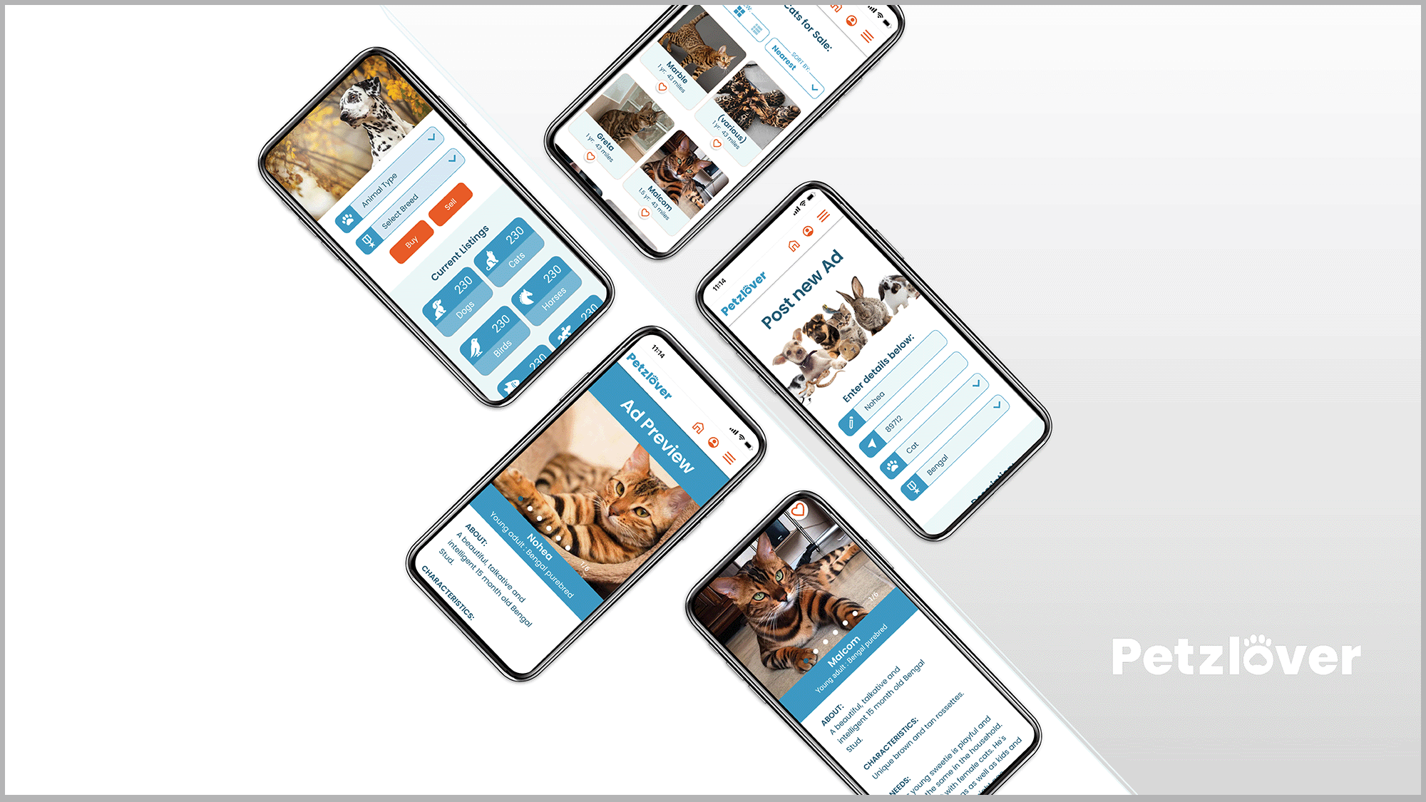
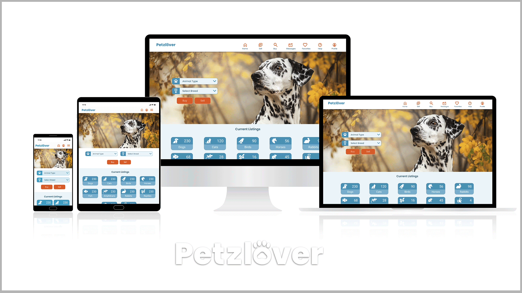
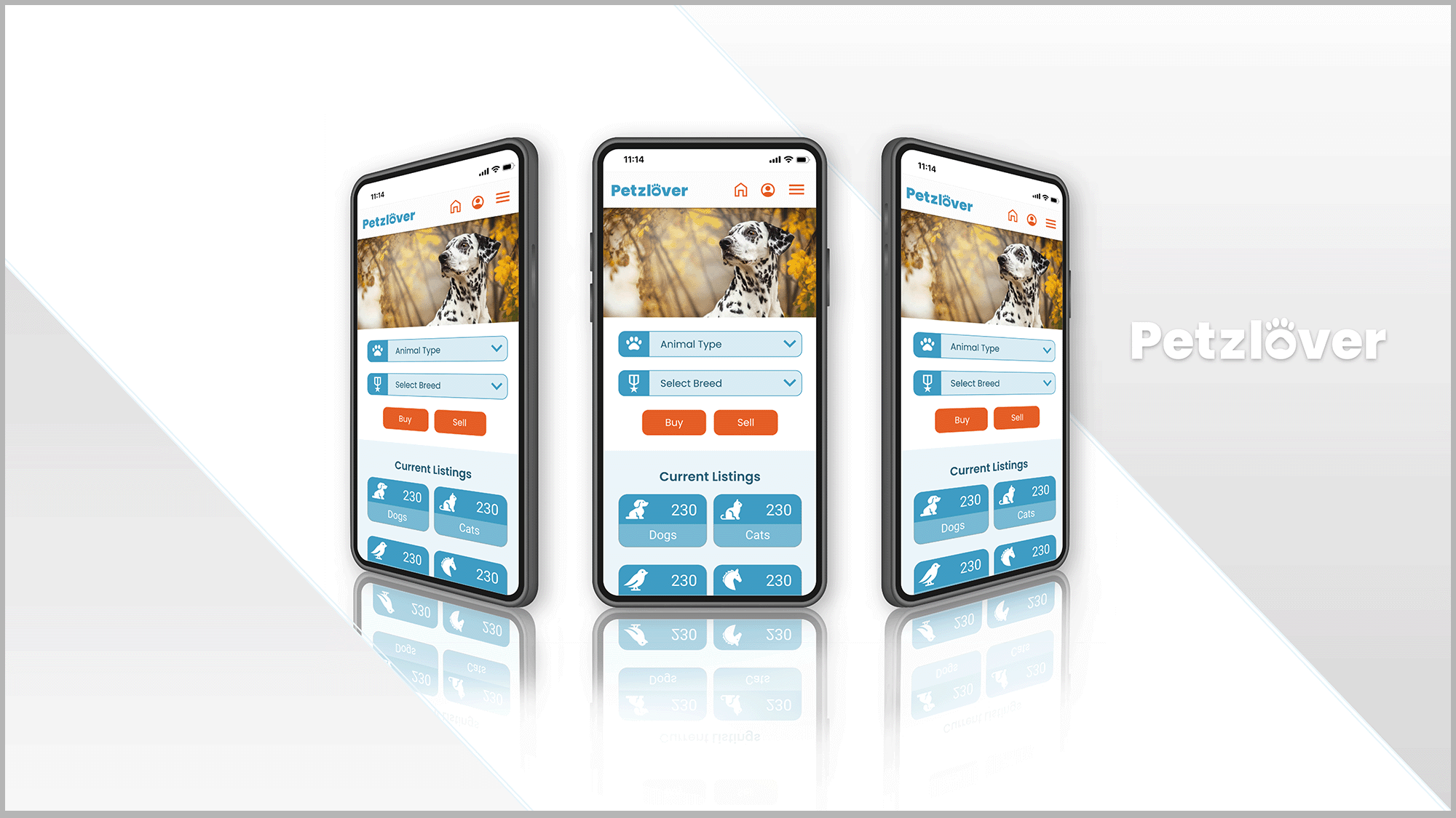
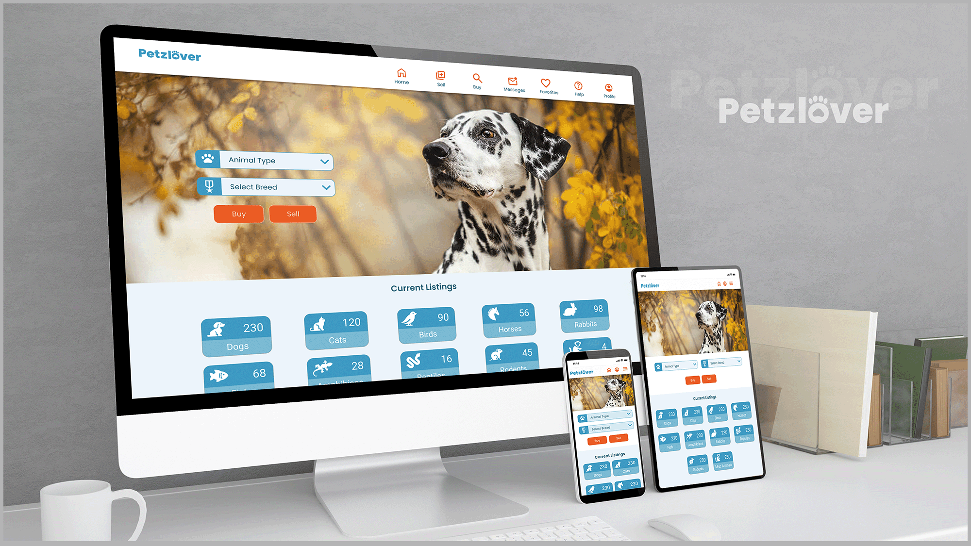
Here you can see the original site (at left) in comparison to a few hi-fidelity wireframes I created (at right). You can also view the original site at Petzlover.com. Overall the redesign features a cleaner, lighter overall feel using light blue and white in the background and behind menus. I lightened up the buttons, changed out several icons and removed the darker grey and bright system colors used for alerts. The deeper orange call-to-action buttons replace the original yellow buttons and generally sit on a cleaner, white background for contrast. Below is a desktop version of the new home page displaying these changes.
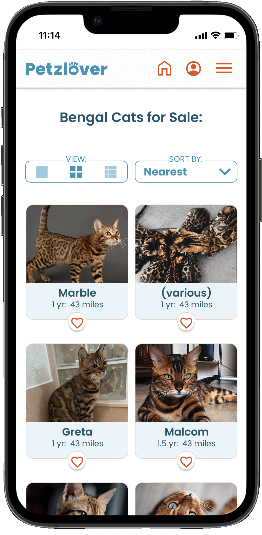
Search
The redesign features drop down menus and also now includes the ability the filter results by breeds, owners, rescues/shelters or all of the above.
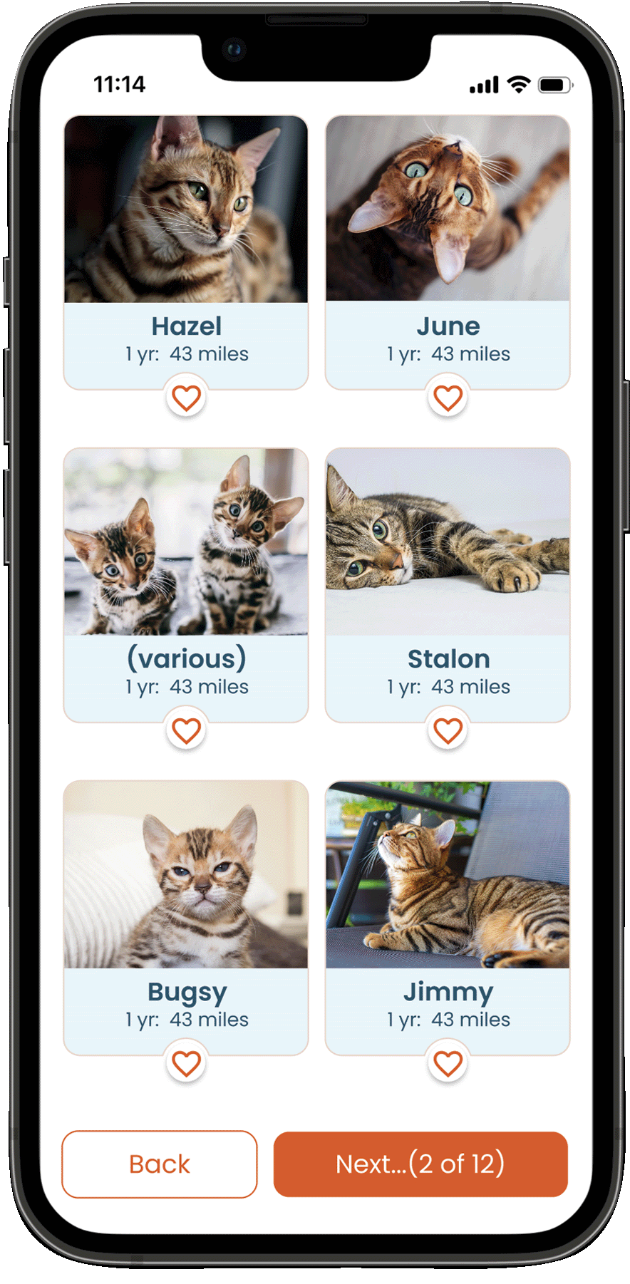
Search Results
The search results have more viewing options as well as sorting filters. The content is more simplified to provide more images for the user to quickly view more animals.
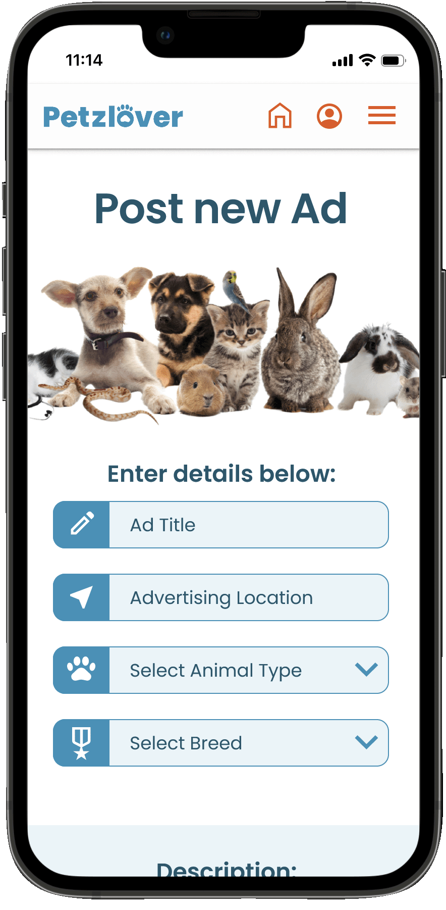
Posting a New Ad
New design offers the user more guidance and a playful image & headline to help distinguish the "selling" area.
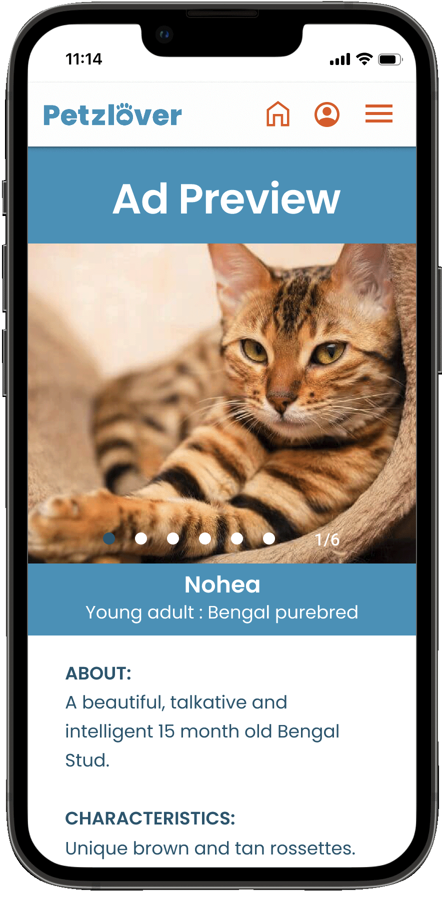
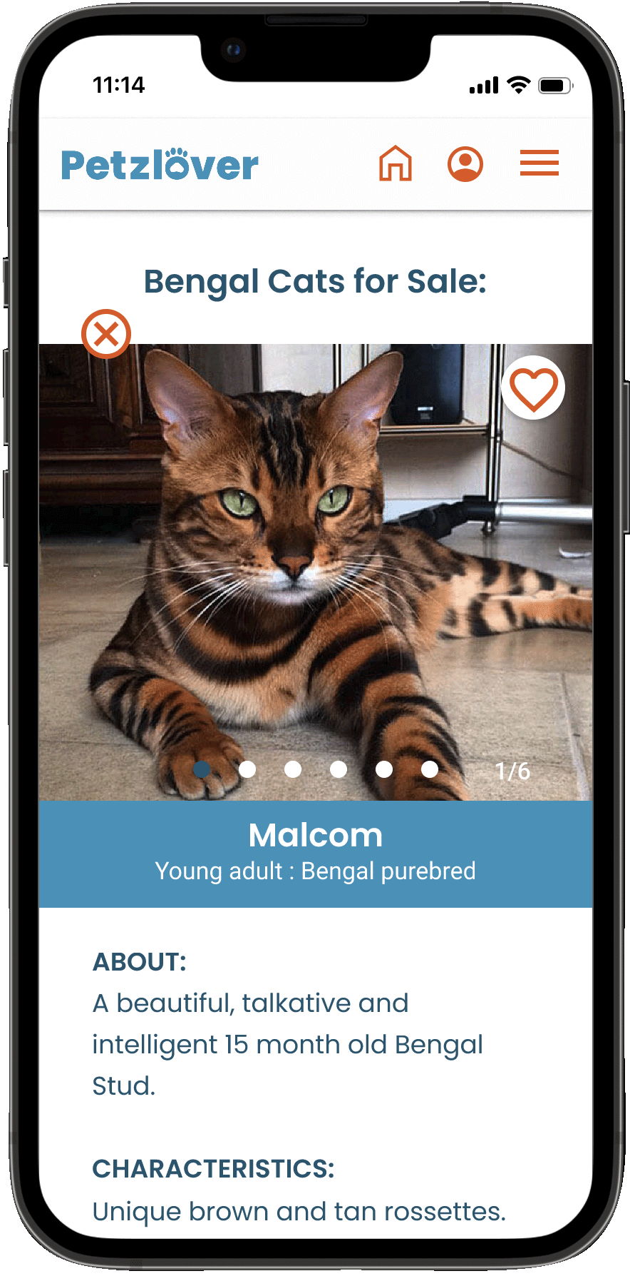
Ad Preview
Now displays how other users would see your ad, by removing it from your Profile page and making the first image fill the screen on a smaller device.
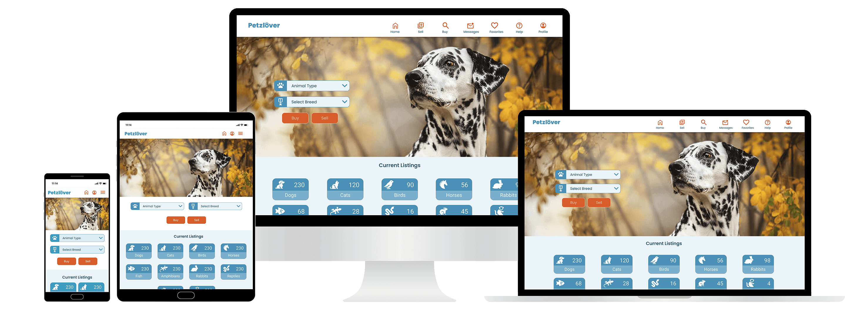
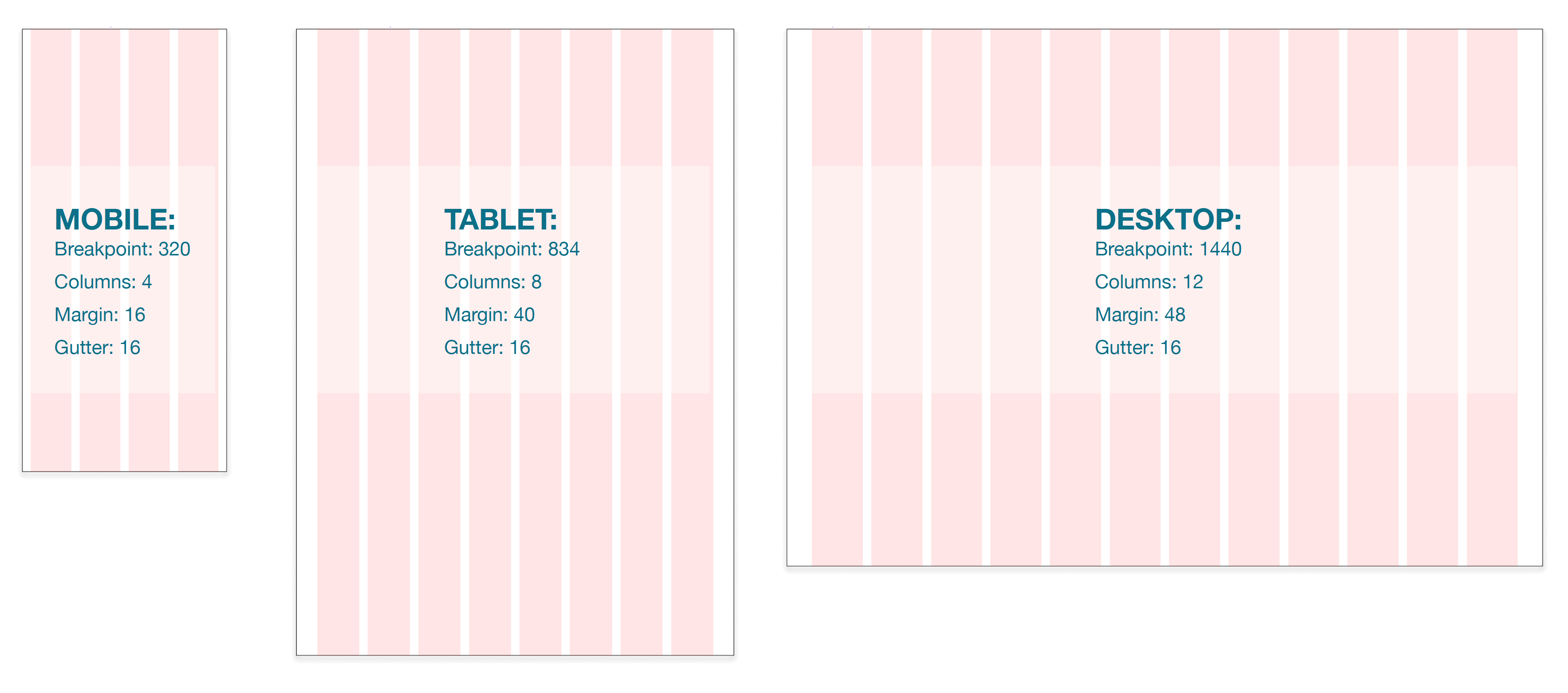
Breakpoint Mockups
Though I started with a "mobile first" approach in this redesign, the goal is to make this application responsive on every device. Beginning with the smallest space first is the most difficult and where I have to be more "content aware" with the most limited real estate. So the following breakpoints (when the design needs to respond and change accordingly) are shown below on various devices; namely the initial mobile app, tablet and finally desktop or laptop versions.
Final Prototype
Takeaways
The biggest challenge was trying to keep some similarities and all the functionality in tact as it is on the original Petzlover site, while still giving it a completely new face lift. For example, narrowing down the color palette was challenging in trying to lighten up the site but still relate it to the original. Also, when expanding the design to different breakpoints (desktop especially) as well as maintaining a consistent look and feel through the various stages of the design needed some thought and reiteration.
I appreciated the inclusion of the Mood board because it's a nice "brainstorming stage" that can really lead the design later on. The project also confirmed the need for constant reiteration at any stage in the process, as it really does evolve in a non-linear fashion. We never stop learning and trying to new approaches. And it made me appreciate the user testing stage for this reason.
Next Steps: Conduct usability testing to continue improving the application and expand the functionality on Tablet and Desktop.
Copyright © 2023 Color Driven - All rights reserved.